
The SaaS UX audit checklist.
The exact audit a Denovers designer runs on day one of every paid engagement. Built for B2B SaaS, AI-native products, fintech, healthtech, and complex software.
Your SaaS feels off. You cannot name where.
Drop-off is high. Activation is flat. Support keeps fielding the same five questions. Churn is creeping past your model. You do not need another opinion. You need a structured second pair of eyes, one that knows exactly which surfaces to look at and in what order.
This is that second pair of eyes, in a PDF. 22 sections covering every surface a B2B SaaS designer touches in week one. Walk it with your team, mark the failures, rank by user-frequency × business impact. Most teams know what to fix before page 10.
Twenty-two sections. One hundred eighty plus checkpoints.
Every surface a B2B SaaS designer touches in week one of a paid audit. Open the PDF, pick a surface, walk the checkpoints, mark what fails, ship the top three.
What a section looks like inside the PDF.
No filler, no fluff. Every section is one page: short intro, a stack of mark-as-you-go checkpoints, room to scribble. Built to be read on screen or printed and pinned.
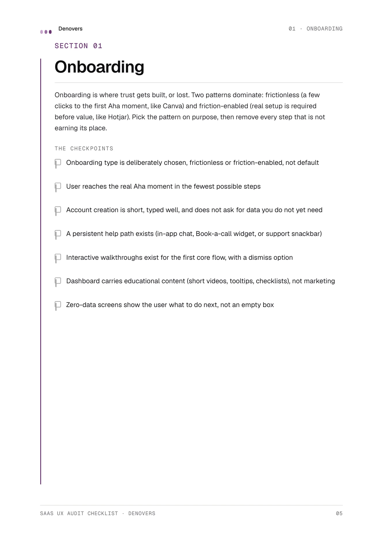
Page 04 · Onboarding · The frictionless vs friction-enabled question
Opinionated. Not generic.
Every "ultimate" UX checklist on the internet is too long to use and too generic to trust. This one is the opposite. It only includes checkpoints we have seen real B2B SaaS products get wrong enough times to name. Ship the top three from every section and your product is already in the 95th percentile.
Get the checklist free.
We send the PDF straight to your inbox. No drip sequence, no "Product Strategist" calling you tomorrow. Just the file.
Built for the people who actually ship the product.
Three roles, three different reasons to walk the checklist. Same outcome: a prioritised list of UX defects you can ship against next sprint.
You suspect UX is hurting growth.
Drop-off is high, support is busy, conversions are flat. You need a diagnostic in your inbox tonight, before you sign off another design rebuild.
You need a structured review.
You can feel something is off but want a framework to prove it. The checklist gives you ammunition for the next backlog grooming and the next exec readout.
You want a self-audit framework.
You already audit internally. The checklist plugs into your existing process and surfaces things you might be too close to see.
The questions before you download.
If your question is not here, email hello@denovers.com. We answer the same day.
What format is the checklist?
A 27-page PDF, A4, around 190 KB. Designed to print clean or read on screen. Each surface gets one page: short intro, a stack of checkpoints with empty boxes, and room to scribble. Mark, prioritise, ship.
Is it really free?
Yes. No card, no trial, no paywall. We trade the PDF for an email so we can send the occasional UX research note. Unsubscribe in one click.
What makes this different from other UX checklists online?
This is the actual checklist a Denovers designer runs on day one of a paid engagement. Every checkpoint maps to a defect we have found and fixed in real B2B SaaS products. No generic Nielsen reheats, no template scraped from a 2012 blog post.
Is it specific to a particular SaaS vertical?
It works across B2B SaaS, AI-native products, fintech, healthtech, proptech, and enterprise software. Anywhere a complex product has users who can leave. We have shipped across all of those verticals and the checkpoints translate cleanly.
Will I get a sales sequence?
You will get the PDF, then one short follow-up offering a free trial sprint if you want it. After that, only occasional research drops. We do not run multi-touch sequences. We do not have an SDR team. You are talking to the designers.
Can I share it with my team?
Please do. The PDF is built to be marked up by the whole product team, one section at a time. We have customers who run it as a Friday team ritual.