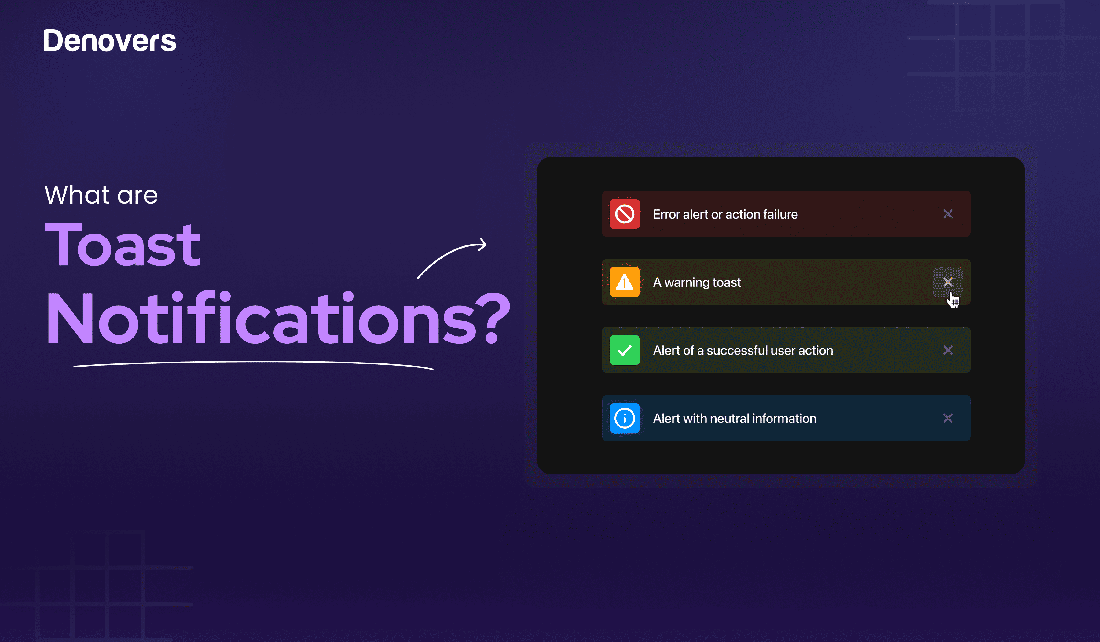
You might think users are attracted to your SaaS platforms because of their aesthetics. Sure, but it’s not limited to that. Yes, they will be attracted to it, but what hooks them? It’s the user experience. And a toast notification plays a great role in amplifying it. These are brief messages that come to alert the users about system events without interrupting their task flows.
Being a product design agency who have worked on 45+ UX and SaaS projects where we have used toast notifications several times, it puts us in the perfect position to shed light on everything you need to know about toast messages, stretching from when to and when not to use them, how to implement them, and what impact they have on the UX of your SaaS product.
But before we jump into the nitty gritty of a toaster alert, let’s first learn what a toast notification is.
Let’s get started!
What is a Toast Notification?
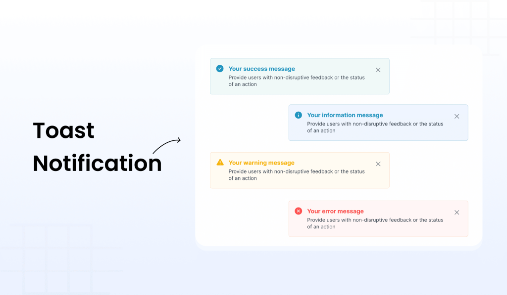
A toast notification is a brief alert or message that informs the user about a system event or what’s happening in that particular scenario on a SaaS application. Microsoft introduced toast notifications in Windows 8. As their name suggests, these UI components are light and crisp, like toast.
What makes them so special is their ability to subtly interact with the user without disrupting their workflows. They are time-bound as they come, deliver the message, and disappear within seconds.
This UI element is also called toast popup, as it pops up on the screen. However, unlike popup modals, they don’t require the user to close them as they disappear on their own to ensure they remain unobtrusive.
Now that we know what a UI toast is let’s look at when and when not to use it to create the perfect user experience and keep your users hooked on your SaaS products.
When to use toast notification?
There are several instances where a toast notification can be used. Let’s see some of them.
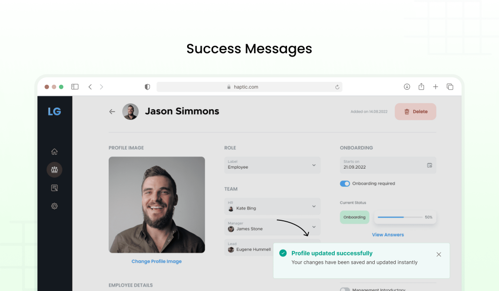
Success Messages: After completing an action like submitting a form, saving data, or processing a request (e.g., “Profile updated successfully”).
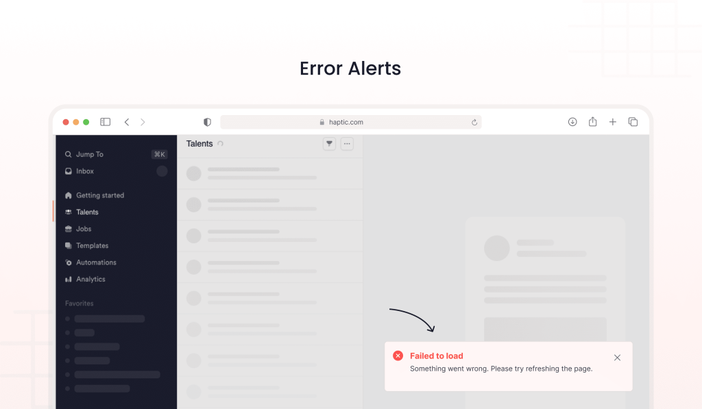
Error Alerts: To inform users about issues that don’t prevent them from continuing but need attention (e.g., “Failed to load the page, try again later”).
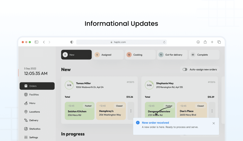
Informational Updates: For important yet non-critical information (e.g., “New order received” or “Feature available for a limited time”).
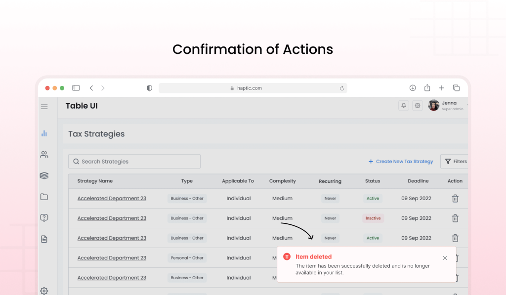
Confirmation of Actions: After executing an action, toast notifications can confirm the result (e.g., “Item deleted”).
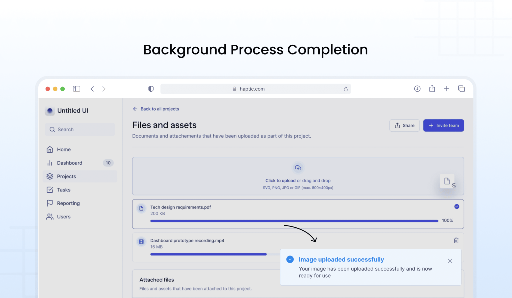
Background Process Completion: When background tasks are finished, such as file uploads, synchronization, or a background calculation (e.g., “File uploaded successfully”).
Connection Status Changes: Indicating network or server status (e.g., “Connected” or “No Internet connection”).
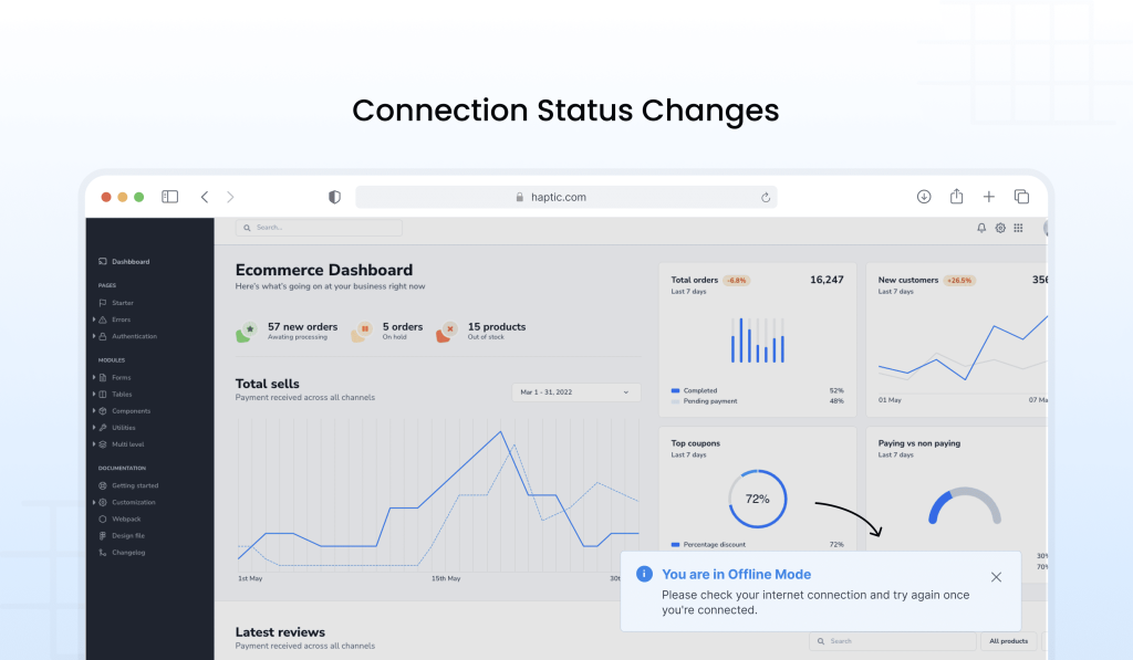
Now that you have seen when to use toast, it would be wise to also see when to not use toast notifications for better understanding. Hence, let’s look at that.
When to NOT USE Toast Notifications
There are many events where using a toast notification is no less than a nightmare. Let’s see when not to use them.
Critical Actions or Errors: Important errors like payment failures or security issues need more visibility than toasts can provide.
Long or Complex Information: A toast notification isn’t suitable for detailed instructions or large chunks of information.
Immediate Interaction Required: A toast alert is passive and doesn’t work for situations that need quick user input.
Repeated or Frequent Notifications: Too many toasts can frustrate users or cause them to ignore key updates.
When Users Are in Focus Mode: Interrupting users with toasts during tasks can break their concentration unnecessarily.
For Persistent Information: Toasts disappear quickly, making them unsuitable for information users need to reference later.
On Mobile Devices for Critical Feedback: Toasts can be missed on smaller screens, making them unreliable for important messages.
Moving forward, it is not just necessary to focus on when and when not to use a toast notification. It’s also important to ensure they are placed right. This is what we will discuss now.
Where to Place Toast Notifications?
Here are some tips to ensure you place the correct toast notification in your UX design.
- Optimal Placement: Position toast notifications at the top-centre or top-right for best visibility and minimal disruption. Be mindful of top-right placement for screen magnifier users.
- Context-Dependent Placement: Placement varies depending on the use case and information type. Windows and Mac place toast near status bars, following the Law of Proximity.
- Positioning with Badging: When badging is used, toasts should be placed below it to maintain a clear visual hierarchy.
- Avoid Blocking Key Content: Toasts should not cover important content or actions to avoid disrupting user interactions.
- No Toasts in Modal or Wizard Interfaces: Avoid displaying toasts when users are in modal or wizard interfaces, as these require focused attention.
Considering our above discussion on the correct placement of a toaster alert, you might wonder why we are stressing this factor so much. This is because toast notifications significantly impact the user experience. Want to know how exactly? Let’s see!
How do toast notifications impact user experience?
Toast notifications are a key feature in both web and mobile apps today, offering users quick feedback on actions or outcomes without interrupting their workflow. Whether confirming a successful task, alerting about a potential problem, or providing updates on system events, these subtle notifications are essential for app-user communication.
However, if a toast message is overused or poorly executed, users may begin to lose confidence in the app. When important details are frequently missed, or users feel bombarded by excessive notifications, they may doubt the platform’s reliability. This can potentially lead to reduced engagement or even abandonment.
Moving forward, we would like to highlight some of the best practices to stick to while creating a toast UX design. Let’s look at them.
10 Best Practices to Implement Toast Notifications
Here are some essential tips and tricks to create a promising toast UX design.
1. Ensure toasts are clear and useful.
Design toast notifications with a clear purpose so that users quickly understand their meaning without interrupting their workflow. Customize the content to specific user scenarios to add value.
2. Choose appropriate UI elements.
- It is important to pick the right elements for a top-tier toast UX design. Here are some ways of doing so.
- Use colors and icons to convey the message quickly (e.g., red for errors, green for success).
- Include buttons to enable users to take immediate action or dismiss the notification.
- Use images to enhance clarity and recognition.
- Add quick reply boxes in chat notifications to allow responses without switching contexts.
- Provide a context menu in group chats for actions like muting.
- Include progress bars for tasks like downloads to show completion status.
3. Give users control and flexibility.
Allow users to interact with or dismiss toast notifications to offer them autonomy. Let the user click a toast to undo an action or simply ignore it to indicate their choice.
4. Ensure consistency and standards.
Toast notifications should follow a uniform design and placement to make user behavior predictable.
5. Prevent errors by using toasts correctly.
Limit the toast message to non-critical updates and reserve them for positive feedback rather than error messages. For instance, in an e-commerce app, you can use a toast to confirm an item has been added to the cart but avoid using it for payment errors.
6. Enhance efficiency
Toast notifications should provide information or updates without requiring users to leave their current screen or navigate through multiple menus. Take the example of a navigation app that displays real-time traffic alerts through a toast notification to keep users updated without disrupting their experience.
7. Avoid overwhelming users
Notifications of any type should be non-intrusive and easy to manage. Introduce a Notification Center to let users conveniently review alerts and information. This will keep the space organized by removing outdated notifications.
8. Respond to user actions thoughtfully.
- A toaster alert should trigger actions based on user intent to offer clear and deliberate responses like:
- Clicking the notification opens the app in context.
- Clicking a button within the notification initiates a task relevant to that action.
- Background tasks (e.g., quick replies) shouldn’t launch the app.
9. Keep the design simple and clean.
Design toast notifications to be visually minimal and non-disruptive. Make sure they fit seamlessly into the screen for an exceptional toast UX design.
10. Include an easy close option.
All toast notifications should feature an “x” button for manual dismissal, even if they auto-dismiss after a few seconds.
Furthermore, to better understand the successful implementation of a toast message, let’s look at how several SaaS platforms use it.
Examples of toast notifications
There are several applications that use toast notifications. Let’s have a look at them.
- Slack: Displays toast notifications for new messages, mentions, or updates from channels or direct messages when you’re not actively on the app.
- Microsoft Outlook: Sends toast notifications for incoming emails or calendar event reminders to keep users informed without interrupting their workflow.
- WhatsApp: Shows toast notifications for incoming messages, particularly on Android devices, where a small banner appears at the top of the screen for a few seconds.
- Facebook: Uses toast notifications for new likes, comments, or messages when you’re not actively using the app, allowing you to interact with new updates quickly.
- Spotify: Displays toast notifications when a new song starts playing or switching between different playlists or devices.
- Android Operating System: System-level toast notifications are used to alert users about various background tasks, such as app installations, downloads, or network connectivity changes.
- Uber: Uses toast notifications to notify users when their ride is arriving or when there are changes to the ride status.
- Trello: Provides a toast notification when a card has been moved, updated, or commented on to keep users aware of team activity.
- Instagram: Sends toast notifications for new followers, comments, or direct messages, providing quick updates even when users aren’t actively engaged in the app.
In a Nutshell
And here we are. By now, you have it all about a toast notification, ranging from what they are and when to use and not use them to their impact on the user and best practices to create the perfect toast alert. The easy way to ensure the right implementation of a toast message is by understanding.
- Your audience
- The type of information you wish to share
- The context in which it needs to be delivered
Still confused about how to integrate toast notifications in your products? Denover’s got you covered!
We can step up your user product’s UX by integrating toast notifications in the right places due to our given experience and UX design expertise.
Get a free demo from us to experience our product design customized services!
FAQs
What is the difference between a toast and an alert message?
Toast messages are brief, system-generated notifications that appear after a user takes an action. They offer context-specific feedback related to that action. On the other hand, alert messages provide clear, context-driven information that grabs the user’s attention without interrupting or obstructing their current task.
What is the purpose of the toast message?
Toast messages are used to provide quick, simple feedback to users, typically following an action they’ve taken. These messages communicate whether the action was successful or not, are visible for only a few seconds, and occupy a small area on the screen without disrupting the user’s workflow.
Why are toast notifications called toast?
The term “toast” in this context doesn’t refer to toasted bread but likely comes from the tradition of raising a glass in celebration with a brief speech during meals. The short, fleeting nature of toast notifications reflects this brief acknowledgement or congratulation.
What is the difference between a toast and a modal message?
A toast notification is called so because it appears briefly, much like a piece of toast popping up from a toaster. Unlike modal messages, which require user interaction and interrupt the flow of tasks, toast messages provide information passively and don’t block the user’s ability to continue interacting with the interface.


