Ever looked at a website or a product and thought, Wow, everything just feels… right? Like every button, image, and line of text was meant to be exactly where it is? Wondering how that is achieved? This magic is done through grid design. Grids provide designers with a framework to position and align elements on a page. This establishes a sense of order and structure. Grids are structures that turn chaos into clarity, which makes the design not only visible but also felt.
Our designers at Denovers create various SaaS products and web and mobile applications, and we effectively use grid layouts to ensure the design is organized, smooth, and efficient. In this article, we would like to shed light on grid design and its best practices to ensure your products have structure, balance, and clarity to give a smooth and organized user experience.
Let’s first begin by understanding what grid design is.
What are Grids?
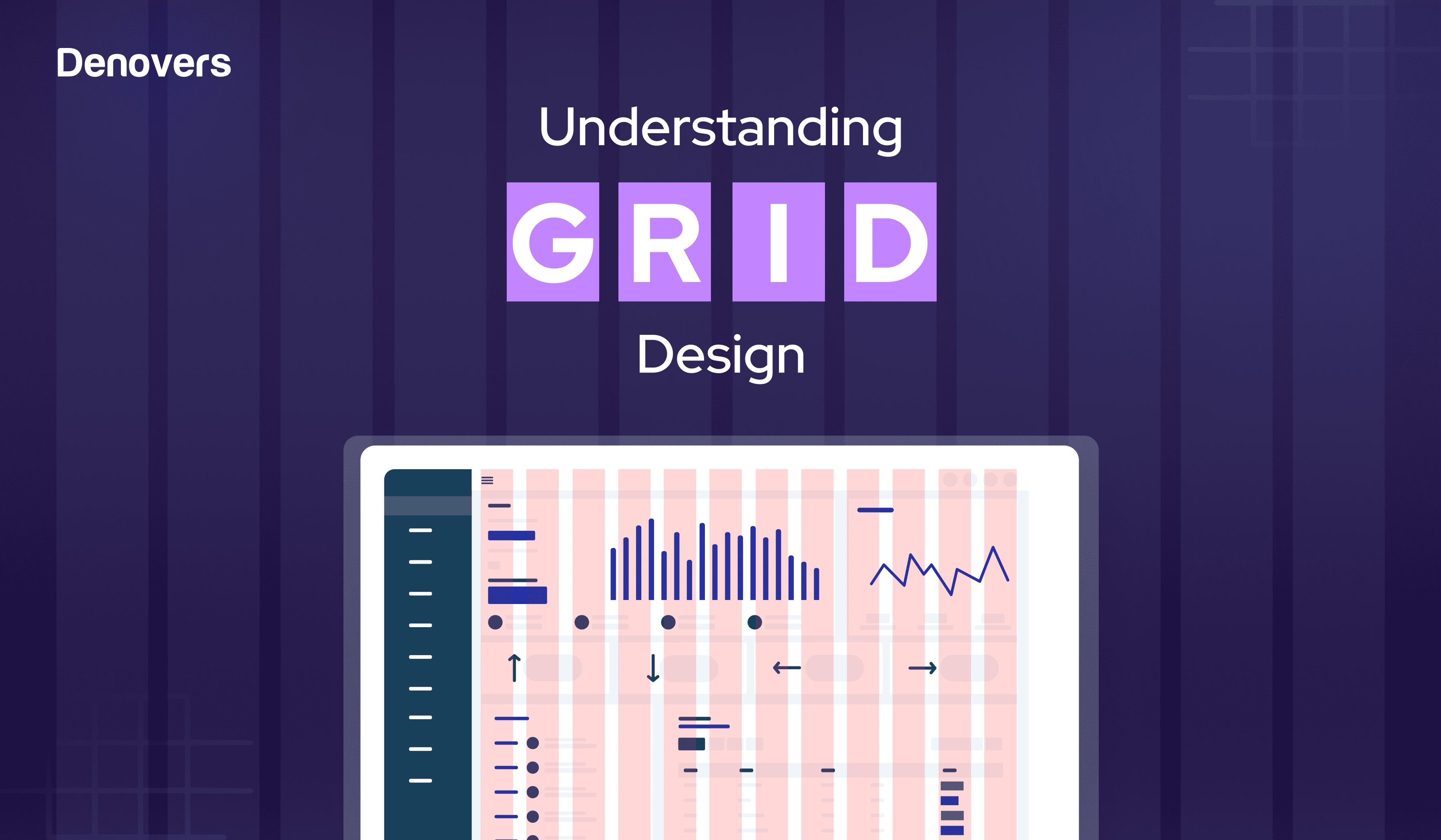
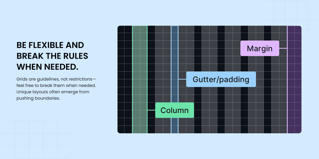
Every masterpiece starts with a foundation. In design, that foundation is the grid design. These are frameworks made up of intersecting columns and lines that organize the layout of a website, app, or print project. Grids establish the placement of text blocks, images, and other elements within the design. Regardless of the grid’s size or format, three primary parts make up its structure: columns, gutters, and margins. A grid-based design approach uses these frameworks to create a cohesive layout.
Whether it’s a page or a digital screen, graphic and web designers work within a rectangular space, which influences the overall grid structure. Designers can either create custom grids or use existing grid systems. They apply one system consistently across the entire design or adapt different grids to individual pages to achieve specific creative goals.
The essential parts of a grid layout include:
– Columns: Vertical sections that organize content and form the main structure.
– Gutters: Gaps between columns that provide visual separation and enhance readability.
– Margins: Blank spaces around the edges that frame the design as a whole.
Grids are crucial in UI and graphic design as they help to divide a layout into predictable, structured sections. Although grids are often invisible, they’re a foundational element in nearly every user interface, guiding the overall design.
Now that you have an understanding of what grids are let’s drill down to the various types of grids.
What are the types of Grids?
Here are the 5 types of grids.
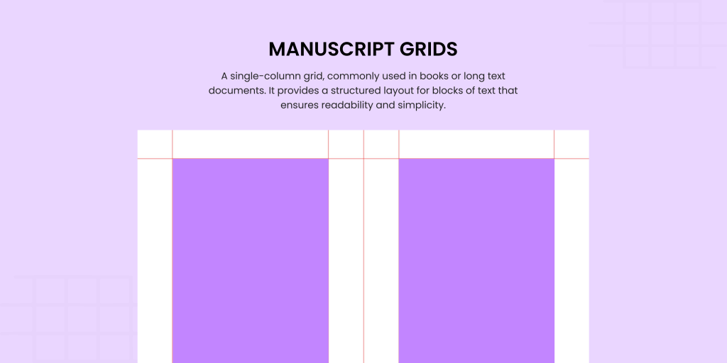
1. Manuscript Grids
A manuscript grid is like a book page, which has one large column dedicated to continuous text. This keeps your design clean, focused, and highly readable. This grid is perfect for ebooks, presentations, and documents. It’s ideal when the goal is to present large amounts of text without overwhelming the reader. Manuscript grids are your go-to for creating an uncluttered, professional look.
2. Column Grids
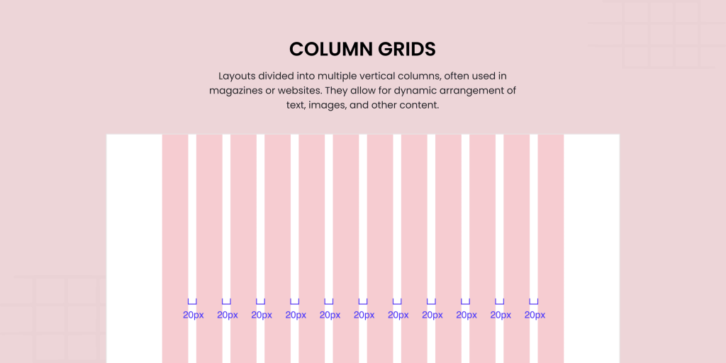
The column grid is a designer’s best friend. It divides the page into multiple columns to create a flexible framework for content placement. Whether you’re designing a magazine layout, blog, or web page, column grids organize text, images, and even ads into visually balanced sections. Want to showcase an illustration on one side and text on the other? No problem. The column grid layout makes it easy to assign zones. This makes everything harmoniously fit while remaining easy to read.
3. Baseline Grids
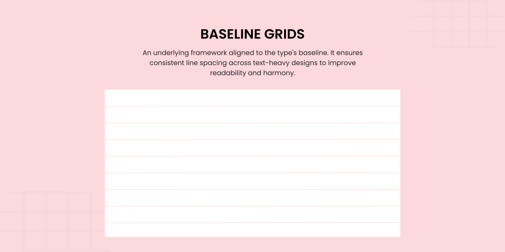
Do you remember the ruled lines in your old school notebook? That is exactly the essence of a baseline grid. These horizontal lines create a structured rhythm for text to ensure perfect alignment across columns. While often paired with column grids, baseline grid design shines in both print and digital design. Baseline grids work perfectly, particularly for text-heavy layouts like books or web pages. They’re the secret to maintaining consistency and enhancing readability. This gives your designs a polished and professional feel.
4. Modular Grids
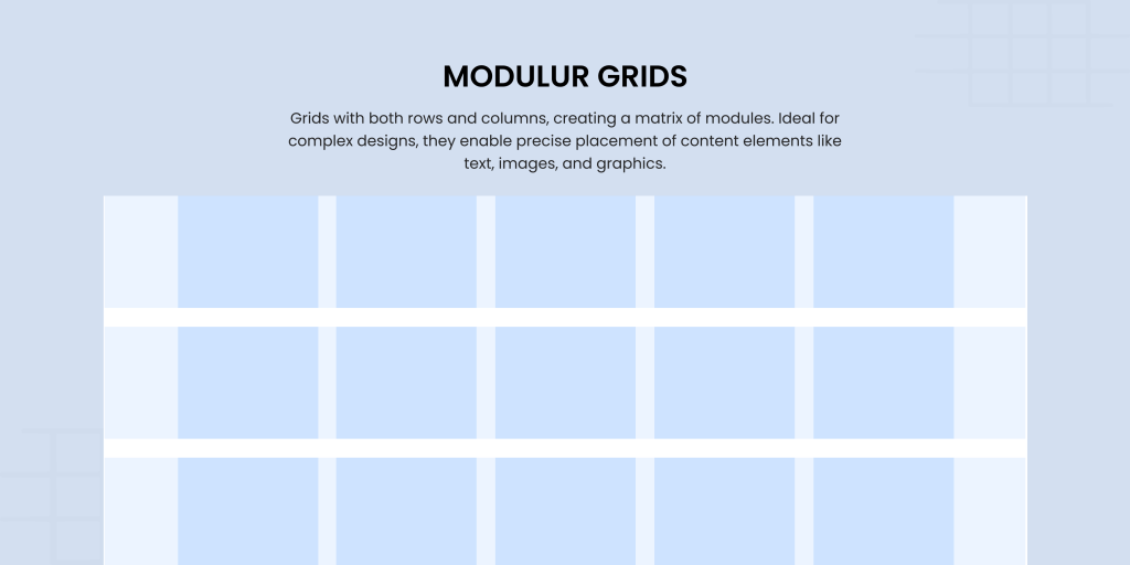
Take a column grid, add rows, and voilà, you have a modular grid. This checkerboard-like structure creates individual “modules” that help organize complex layouts. Whether you’re designing newspapers, calendars, or data-heavy websites, modular grids bring clarity to the confusion. They’re especially useful for projects with multiple levels of hierarchy, like varying font sizes or intricate layouts. They ensure every piece of content finds its perfect spot.
5. Hierarchical Grids
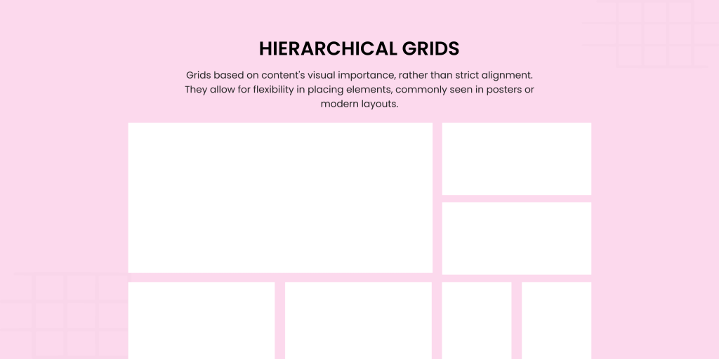
Not all content fits neatly into a box, and that’s where hierarchical grids come in. These irregular grids adapt to the needs of your design to offer flexibility while still maintaining structure. They are perfect for
- Infographics
- Posters
- Unique web designs.
The hierarchical grid design allows you to emphasize certain elements over others to create visual interest and guide user attention. Think of them as a creative playground where content dictates the rules.
Moving forward, to better understand the grid-based design system, let’s have a look at some of the best practices inspired by the designers at Denovers to create the best digital products.
Best practices to make grids
Let’s have a look at some of the best practices to design grids for your websites or applications.
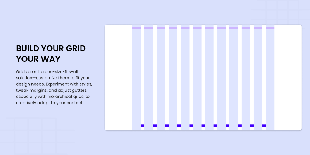
Build Your Grid Your Way
Grid designs aren’t one-size-fits-all. Feel free to customize them according to your design needs. You can combine different grid styles, tweak column widths, adjust margins, and play around with gutter sizes until the layout meets your needs. You should know that experimentation is key, especially when working with hierarchical grids, as they allow you to adapt to content creatively.
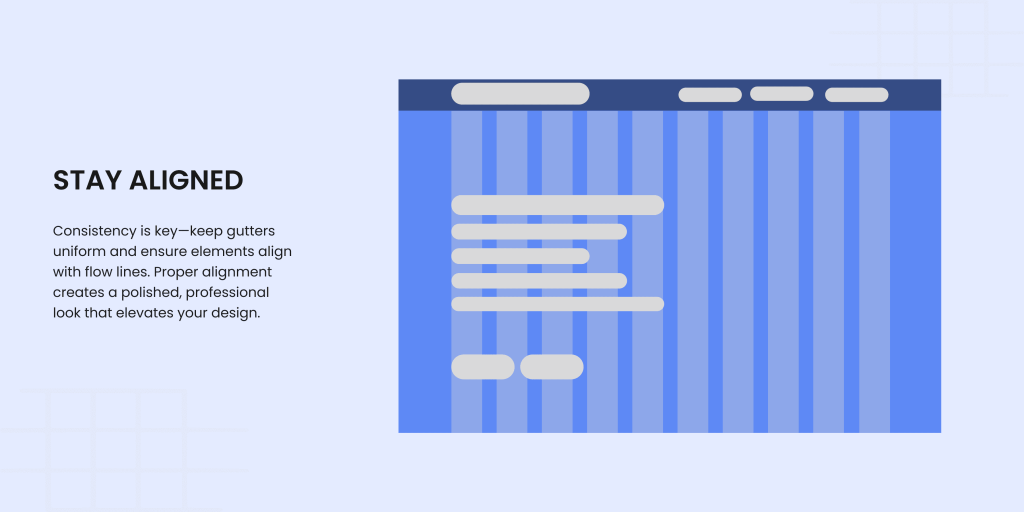
Stay Aligned
Grids thrive on alignment. Keep gutters consistent throughout your design and ensure all elements touch flow lines for a cohesive look. Alignment isn’t just a technical requirement. It’s the backbone of a polished and professional layout.
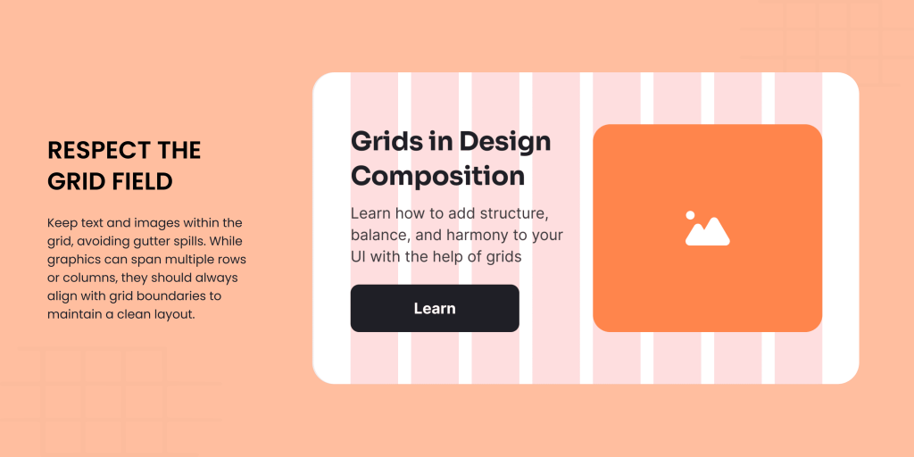
Respect the Grid Field
You need to keep elements like text and images within the grid field and avoid spilling into the gutters. Graphics can cover multiple rows or columns, but they should always start and end within the grid. This keeps those gutters pristine and blank to divide the layout beautifully.
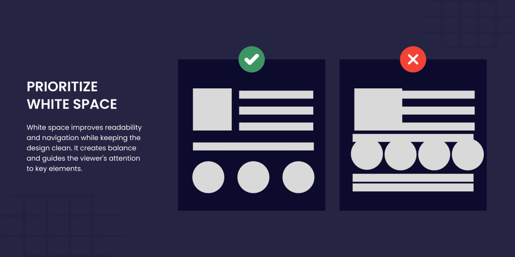
Prioritize White Space
Don’t underestimate the power of white space (or negative space) as it
- Creates breathing room between elements
- Improves navigation
- Keep the design clean.
Whether you’re working on a web page or a print layout, white space brings balance and focus that guides the viewer’s attention.
Use Proportion rule
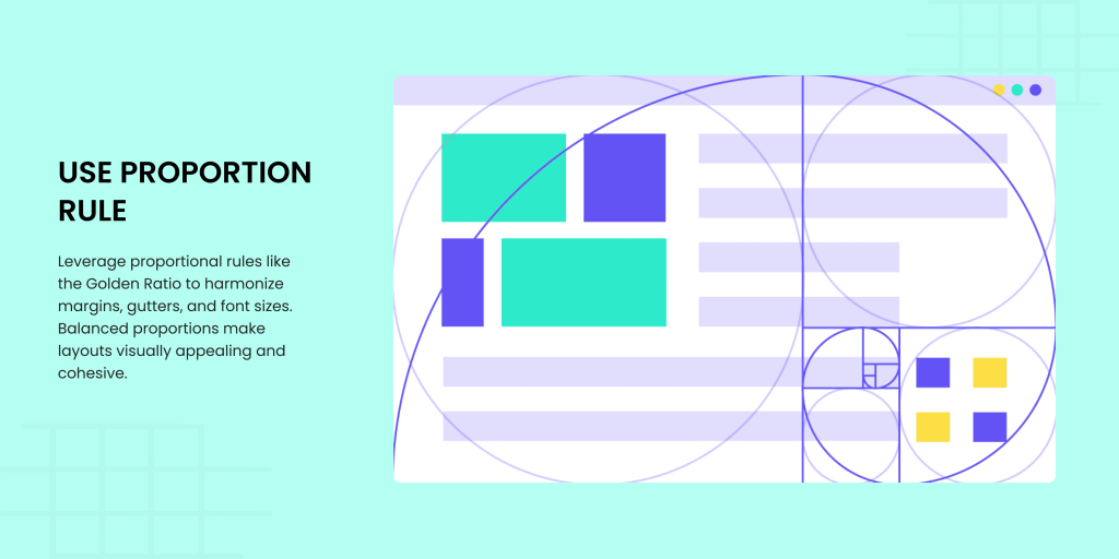
Proportional rules like the Golden Ratio and Fibonacci Sequence aren’t just for math enthusiasts. They’re invaluable for grids and layout design. Use them to harmonize margins, gutters, and font sizes. For example, if your inside margin is 2, your top margin could be 3, the outside margin 5, and the bottom margin 8. This proportional balance makes your design pleasing to the eye and naturally cohesive.
Honour the Rule of Thirds
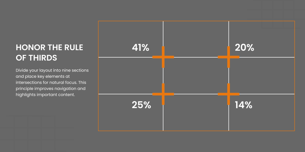
The Rule of Thirds is all about dividing your layout into nine equal sections with two horizontal and two vertical lines. Place key elements at the intersections or along these lines to naturally draw attention to them. This principle not only enhances navigation but also helps determine where to place crucial elements on your grid structure for maximum impact.
Think responsively
A responsive grid is non-negotiable in modern design. Whether it’s four columns for mobile, eight for tablets, or twelve for desktops, ensure your grid design smoothly adapts to different screen sizes. Use percentages rather than fixed dimensions to maintain balance across devices without compromising content.

Play with angles
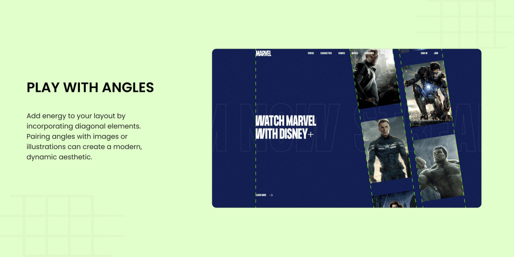
Add a modern twist by incorporating diagonals into your design. Diagonal elements can enhance the energy of your layout and pair well with illustrations or images to create a dynamic and modern aesthetic.
Be flexible and break the rules when needed.
Grids are tools, not cages. Don’t hesitate to step outside the gridlines if your design calls for an unconventional grid layout or a unique element placement. Creativity often thrives in those moments of rebellion.
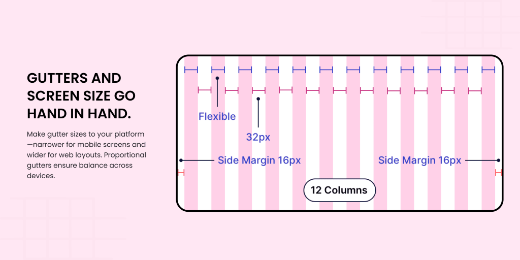
Gutters and screen size go hand in hand.
Gutters are more than just separators. They’re vital for maintaining balance. On mobile screens, narrower gutters work better, while web designs can benefit from slightly larger spacing between columns. Adjust gutter sizes proportionally to ensure a harmonious layout.
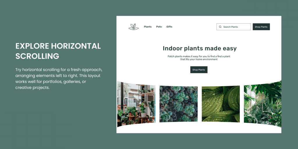
Explore Horizontal Scrolling
Break away from traditional vertical grid layouts and try horizontal scrolling ones. In this setup, elements are arranged from left to right, with the design flowing in the opposite direction. It’s a fresh take for portfolios, galleries, or any project needing a bit of flair.
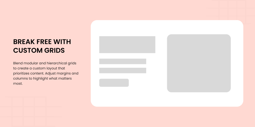
Break Free with Custom Grids
Feeling experimental? Mix modular and hierarchical grids to create a custom grid layout that prioritizes your content. Adjust margins, columns, and gutters to highlight what matters most and deliver your message effectively.
Conclusion
And here we are! In view of the above discussion, we are sure you now understand the drill for grid design. Grid layouts are taking centre stage with the rise of responsive design and for a good reason. Grids simplify multi-device support and cut down design complexity. You create a clean visual hierarchy by embracing the grid, as it gives your content a structured, easy-to-read format. And the payoff? Users effortlessly navigate your digital product’s pages to enjoy a smooth and intuitive experience.
If you want to improve the structure and functionality of your designs through grids, Denovers has got you covered. We have experience working on several products where we created user-friendly applications by using grids to bring structure, alignment, and consistency to a visually balanced design.
FAQs
What is the purpose of a grid?
A grid design is a framework of intersecting horizontal and vertical lines that serves as a guide for aligning design elements. It ensures layouts are structured and consistent. This prevents design elements from shifting or resizing unpredictably across different pages, which contributes to a cohesive website appearance.
What is the 12-8-4 grid system?
The 12–8–4 column system is a popular approach in responsive web design, tailored to adapt layouts to various screen sizes. Usually, 12 columns are used for large desktop displays, 8 columns for tablets, and 4 columns for mobile screens. This ensures designs remain visually balanced across devices.
What is the standard grid size?
Grids are designed to align with screen dimensions. Common examples include:
- Desktop: 1440px wide for standard screens and 1280px for smaller ones.
- Tablet and Mobile: 1024px for tablets and 375px for mobile devices.
What sets a table apart from a grid?
The choice between using a table or a grid depends on the context and the nature of the data being displayed. Tables are ideal for presenting structured information in rows and columns, while grids are better suited for visually representing data through elements like bar charts, line graphs, or pie charts.


