Are you a product owner who is always short of time? From understanding the customers’ and markets’ unique needs to managing and prioritizing product backlogs, a million tasks might be waiting for you every day. This clearly means you won’t have time to go through every stage of product development or management. That’s why you need a dynamic real-time reporting dashboard for improved decision-making. But that’s not enough. You must also select the best dashboard design example if you want an intuitive platform.
Are you wondering where to get the best dashboard design example or how to create one on your own? Buckle up as we are about to throw light on some of the amazing sample dashboard designs in the market and best practices to create the perfect dashboard for your product.
Let’s get started.
What is a Dashboard?

Dashboards are used in SaaS products to offer essential data, including key metrics, KPIs, and other necessary information to monitor the product’s performance. They use graphs, pie charts, tables, maps, and more visually appealing features to make the user interpret the data in one glance. Using visuals to present data makes it super easy for users to view data and make decisions that would benefit them in their journey on the product.
According to a recent survey, it has been estimated that 80% of companies are now using digital dashboards. The reason for this is that control panels like these change complex data and numbers into actionable information that is easy to consume. Companies increasingly use dashboards for effective data monitoring, measuring, and analysis of key areas.
Types of Dashboard Design Example
It has been estimated that one of the major reasons products fail is because you invest in the wrong areas of the business. Similarly, many product owners also pick the wrong dashboard, resulting in inaccurate and valueless information. Therefore, picking the right dashboard design is crucial to ensure your business goals are achieved. There are several types of user dashboards. Let’s have a look at the four general ones.
Strategic Dashboard

Strategic dashboards are created to assess long-term data or KPIs over a specific period. They do not offer day-to-day information about a business’s performance. Instead, these UI dashboards provide a comprehensive business overview throughout the month, quarter, or year. Some data that you can efficiently monitor and analyze from a strategic dashboard include the total earnings, tax, fiscal performance, or amortization. Without a strategic dashboard, there is a high chance that you might overlook key metrics visualization that offers a broad view of how your product has been performing for some time. The strategic user interface dashboard lets you make wise decisions after thoroughly reviewing the overall data.
Operational Dashboards

Operational dashboards are designed to provide real-time data as they inform us about what is happening. After using the defined key metrics, this dashboard design example is mixed into daily tasks and work routines to give us the data for every minute. For instance, when you integrate the Google Analytics user interface dashboard, it updates you about every new member visiting your website.
Analytical Dashboards

The analytics dashboards are created to compile excessive data. This dashboard design will contain vast amounts of data, from qualitative and quantitative data to real-time and historical information. Data analysts primarily collected this crucial information. However, the latest industry trends have moved towards data democratization and new low-code analytics. This even allows non-professionals to create a good-looking dashboard for constructive data analysis. This UI dashboard helps in solving problems through accurate forecasts and realistic targets.
Tactical Dashboards

A tactical dashboard is created to track the performance of mid-level management through analysis and monitoring. This dashboard design example not only helps check the company’s goals but also makes analytical recommendations for future strategies. This dashboard idea also offers tracking to review the company’s strategic initiatives. This way, you can guide your users in the decision-making process as this dashboard allows them to explore data due to its interactive nature.
Our Top-Tier Dashboard Design Example
We at Denovers efficiently address the needs of our valuable customers by designing customized dashboards for them that align with their business requirements. Look at some top-performing dashboard design examples we created for our customers.
Bluemark

Bluemark is a logistic company that came to us for the complete revamp of their inventory dashboard called Nactic. Bluemark wanted a clean dashboard layout that would include all the information in one place for easy data collection and analysis. Denovers came up with one of the best-designed dashboards to ensure all of their inventory and logistics information was on one screen.
We created their UI dashboard from scratch and merged one of their other inventory website to make an inclusive product containing all information. From listing different products and their status to displaying their numbers and trends, our expert UX and UI designers ensured that all the details about their logistics were precisely mentioned. Additionally, we presented the data in aesthetic graphs and pie charts to make the interface go easy on the eyes and for effective data evaluation.
MMACS

Originally known as BoltSend, MMACS is a company that offers mobile wallets, payment APIs to banks, and remittance services across Africa. They wanted us to add some new features to their existing SaaS dashboard. As a result, Denovers came up with an innovative dashboard design example to upgrade their console for aesthetic and easy-to-consume data display. We ensured that all the essential information of their various transactions was listed on a single screen for simple data interpretation. We also made sure to use a blend of contrasting colors to highlight essential information for informed decision-making.
Reconcyle

Reconcile is a fintech platform that offers digital payment network services to banks, mobile wallets, and government sectors across Africa. They wanted a UI dashboard from scratch to the end-user product that would tidily present data for interpretation and examination. Our skilled designers at Denovers came up with a strategic dashboard idea that would mention the various payments made across different platforms. Additionally, we included every information for inclusivity, including the merchant’s name, transaction type, cardholder’s name, currency, amount, and status. We also added a graph to display recent transactions so that you can evaluate the trend to improve business performance.
DSS

DSS is a health information software development and systems integration company that wanted a totally new concept to schedule events in any hospitals or clinics in the USA for doctors through a SaaS App for iPads and iPhones. Denovers assisted them in coming up with a state-of-the-art design dashboard example that would help sales representatives create events in hospitals or clinics. We also added several innovative features, like digital check-ins for doctors who attended the event. The DSS dashboard also ensured that it could efficiently manage expenses.
GP Flow

GP Flow is a technology platform that offers various investment alternatives to help raise capital faster. This company came to us seeking a nice dashboard design to help their investors and general managers with data collection and evaluation. Therefore, our skilled designers came up with a dynamic dashboard example encompassing two views. The first is an investor view where we list all the investors with their information like asset, balance, distribution, and ownership percentage. For better evaluation, we even created a bar graph representing the distribution over months.
The other view we created in this UI dashboard was for the managers, where they could see the complete insights, including active users, sessions, page views, new investments, and total value for enhanced data analysis.
Dizzion

Dizzion is a Desktop as a Software (DaaS) that came to Denovers for its complete dashboard revamp. They wanted to modernize their dashboards’ complete UX and UI, which displays their data centers. We came up with a good-looking dashboard design to makeover the platform entirely. The application got a modern look through dedicated efforts, incorporating the newest design trends with dark and light modes. This revamp aimed to offer users a visually appealing and contemporary experience.
Popular Dashboard Design Examples
It has been estimated that the dashboard design and software market is expected to grow by 1.83% to reach a volume of US$11.60 billion in 2028. This is because several dashboard design examples are emerging and becoming popular throughout the consumer market. Let’s have a look at some of the popular dashboard design examples.
1. HubSpot

HubSpot is one of the many good dashboard examples. They have a unique, visually appealing, and functional approach through their card-based layout. Not only do they display sales and marketing metrics on a single screen of their analytical dashboard, but they also have an easy-to-navigate platform. It is highly fast and efficient as it provides information in seconds. Moreover, it has interactive charts and graphs for improved data analysis.
2. Trello

There is no better UI dashboard if you want to do agile project management or even for normal tasks. They bring an advanced perspective to manage projects and processes efficiently. They show key metrics like assigned cards, due dates, and card per list to manage workloads easily and prevent bottlenecks. It constructively organizes tasks through its card-based layout. You can also keep an eye on your project’s growth through intuitive charts and graphs. Furthermore, it has an innovative feature that enables you to even work in low-light environments.
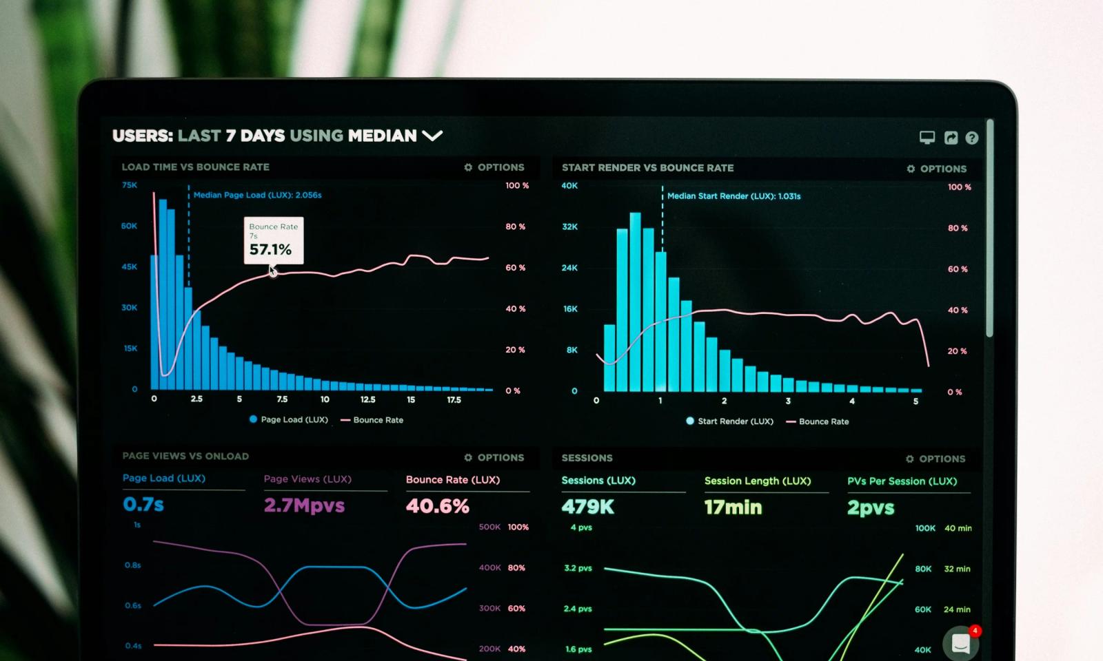
3. Google Analytics

Google Analytics is a dashboard design example that is being increasingly used by different users worldwide. It has been estimated that 28.1 million websites use Google Analytics. Its popularity is due to its minimalistic design, clean interface, and easy-to-read format. This tool also includes various graphs and charts so that users can get a thorough idea of every major and minor detail. Google Analytics allows users to switch between charts and graphs smoothly without breaking logical consistency or flow.
4. Griddle

Another nice dashboard design is that of Griddle, as it offers an interactive and aesthetically appealing interface. Griddle offers the latest design for its interfaces with bright colors. It also comes with sharp and interactive graphics for immediate data analysis. It has a trendy card-based layout, which makes it easier to move around different areas of this product. Several customers prefer Griddle as this platform saves time and money. It offers top-tier spread management and rooming allocation. This is regarded as one of the best dashboards with high functionality to make your tasks simple yet well-optimized.
5. Asana

Asana is an exceptional dashboard design example estimated to offer 20% more organized and streamlined working to teams. Its innovative dashboard is designed to help several teams at the same time. Asana can easily handle several teams’ tasks at once. Its dashboard has a simple and user-friendly interface. It clearly displays tasks and deadlines through a calendar view feature to track due dates easily. Moreover, it offers an excellent visual representation using graphs and charts to provide insights into project progress, pending tasks, errors, and obstacles.
6. WordPress

WordPress is one of the best design dashboards that are widely used worldwide. From handling a website’s settings, tools, and posts to its plugins, media, and more, WordPress is no less than the backbone of developers. Its simple and user-centric dashboard design makes content management easy and efficient. Not only does it help you post and upload content, but it also makes you aware of how well your website is performing. Its high-tech UI dashboard lets you customize your website using different themes and plugins. This increases its visual appeal and functionality. There is also an option of advanced filters to make the research process smooth and productive.
7. TextMagic

TextMagic is a great design dashboard example, focusing mainly on ease of use and user-friendliness. This type of dashboard design attracts users as it has features that are easy to understand and implement. TextMagic offers a sleek and interactive interface. This product discourages clutter, which makes it difficult to interpret important information quickly. Therefore, it comes up with the idea of interactive charts and graphs with bold colors and easy navigation between different sections. This enables on-point data analysis to make informed decisions.
8. Ricochet360

Among various examples of great dashboards, Ricochet360 also has a great ranking. This innovative platform is exclusively focused on enhancing user ability and smoothening the sales process. It has several advanced features which can significantly increase your business through sales. Its dashboard interface offers multiple features like call tracking, reporting, and other lead management tools to ensure you are cracking the right number of sales. Moreover,Ricochet360 also allows you to customize your calls according to your business needs and requirements. This user interface dashboard is also known for its exceptional support for maximum results and productivity.
9. Soft UI

Soft UI is another top-tier design dashboard example to create winning websites and webpages. This platform uses several innovative features to create diverse designs that suit the needs of various businesses. It has around 300 front-end individual elements, including buttons like inputs, cards, alerts, navbars, and nav tabs. This offers you a free hand to choose and combine various components to create interfaces of your choice. Soft UI’s dashboard also allows you to modify all components’ colors. Moreover, its user interface also offers lightweight design elements like shadows, gradients, and rounded corners. This web application dashboard design ensures improved accessibility and UX, thereby resulting in easy navigation, increased user engagement, and productivity.
10. Droplr

Droplr is a good dashboard design example as its simple and elegant design makes it easy to use. The Droplr designers have done an excellent job in creating a super clean, responsive, and functional interface. Droplr offers a superb browsing experience as it simplifies things for the end-user by providing all the necessary features right in front. This dashboard should be your go-to if you are into progressive design as it maintains the user’s attention by reducing clutter.
11. Sessions

If you are looking for something modern, gorgeous, and user-centric all at the same time then the Sessions web application is one of the best dashboard layout examples. This dashboard has a highly responsive and fluid topography to resize and adjust according to any device. The designers of Sessions have paid immense attention to the dashboard’s color, fonts, icons, and type choices which makes a clean interface. It offers exceptional ease of use with the transparency in the top bar. Moreover, this dashboard also offers customized features so that users can efficiently organize their health chart by knowing their total running time and schedule.
12. Prescinto

One of the best sample dashboard designs is of Prescinto as it offers top-tier navigation to make it super simple for users to interact with the platform. However, this was not the case before. Its application had complicated and cluttered user flows. The platform also made it difficult to restructure the information architecture which started to become a problem for the users. As a result, its designers used AI to simplify operations and maintenance so that users could easily navigate around the platform and bring maximum return on energy investments. By enhancing Prescinto’s efficiency of the renewable energy management systems, the users got some control. This effective dashboard design example has helped Prescinto acquire the trust of users in 14 countries. It is also looking at over 12,000 MW of clean energy projects and offering a 10x return on investment.
13. To-Do

The To-Do dashboard stands out as an exceptionally crafted work management interface. Its visually appealing design incorporates vibrant colors and well-executed visualizations to make it look attractive from every perspective. The dashboard prominently features a graph spanning the entire bottom of the page which makes it visually impactful. It truly emerges as a winning dashboard as it provides numerous impressive features for individuals looking for user-friendly functionality. It also uses aesthetically pleasing colors, offers a streamlined interface, and an aesthetically pleasing administrative dashboard for its work.
14. Enroly

Enroly is an application created for students to engage. Their team of designers and developers has created a strategic dashboard that is unique as it offers a screen displaying all the necessary stats. For instance, the bar chart allows students to compare contrasting data to build a visual timeline. Moreover, the pie chart lets you visualize proportions. Enroly’s dashboard also has specific cards that include the most essential data to avoid confusion.
15. Ice Warp

If you’re an email marketer then Ice Wrap e-mail client is definitely for you. It has one of the perfect dashboard design examples to manage your emails. Its clear, well-structured, responsive, and alluring dashboard makes email marketing easy and effective for you. Not only does it offer a great visual design and color combination but also has a superb UI. Ice Warp email provides a minimalistic yet solid layout of the interface which makes you want to keep looking at your mail.
16. Hirerise

Hirerise has one of the best dashboard sample designs as it makes the work of HR workers super easy by clearly providing them with an overview of key metrics and performance indicators. The designers of Hirerise have made exceptional efforts in choosing colors that fit so well on the dashboard’s interface. It is also in different topographies and also in light or dark themes. Additionally, users can easily get the data they want from this dashboard due to its analysis features and superb navigation which enables users to easily switch between different sections of the platform.
17. Tymewise

Tymewise is another great application with superb dashboard designs. It offers a wide of range features to completely hook the user. One of the most amazing features includes helping users efficiently manage their time. This is possible through time-tracking tools and productivity analysis. The dashboard is stacked with these advanced features to enhance the user experience so that they stick Tymewise. Moreover, they also let the users control the dashboard so that they can easily navigate through it and access the various features offered in it.
18. Rolodex

Rolodex is a good example of a dashboard with high-tech features that have improved the UX for users. The designers have developed this functional dashboard for users and merchants. Rolodex has undergone a unique use of shadow to give depth to the platform’s interface. They use 3D/flat elements, high-level data, and modular widgets, with a nice gradient backdrop and long shadows. To complement this UI, a translucent background is kept. It is the perfect panel to track and manage your work relationships especially if you have a lot of them.
19. PublishXI

Out of the many dashboard design examples, PublishXI is one of them. This is a popular UX dashboard design as it offers users a simple and easy-to-use interface. The design is contemporary and clean which helps users effectively handle their content. The platform provides interactive tools for monitoring content performance and includes advanced features such as social media scheduling and content optimization. The navigation is user-friendly and allows individuals with varying levels of expertise in content creation to access different sections of the platform seamlessly.
20. Haven Diagnostics

Haven Diagnostics is a perfect dashboard design example that exceptionally displays complex data to predict disease transmission hazards in offices and other industries. Haven Diagnostics has an analytical dashboard that uses graphs to show future projections to forecast the outbreak of diseases before time to take the necessary steps. They use complex mathematical models to predict infection risks so that the necessary measures can be taken to protect corporate offices.
21. VMware

Among various dashboard sample designs, one popular one that stands out is VMware. This cloud-computing platform displays real-time visibility, health, performance, and capacity utilization for virtual infrastructure. Not only does it offer the stats but it also deeply monitors the operations of your operating systems but also troubleshoots and alerts for efficient operations. The features include better productivity, quick problem-solving, optimized resource usage, and reduced downtime.
22. Tromzo

Tromzo is one of the excellent dashboard design examples as it ensures code security. This application features a dual-dashboard system. The first dashboard provides full access which is exclusively reserved for administrators. Meanwhile the second offers limited access which is accessible to the entire team. This dual-dashboard approach ensures a secure and controlled environment for code management. Additionally, to streamline the navigation through extensive data, the app incorporates a variety of filtering options. This helps users in pinpointing the precise information they require. It also has a user-friendly interface. Tromzo goes the extra mile to enhance collaboration and efficiency within the team.
23. FlatLab

FlatLab is a Premium Admin Dashboard template created using Bootstrap. This responsive dashboard has a sleek color palette, well-organized content layout, reusable UI components, hassle-free customization options, and expertly developed code. The design incorporates modern web technologies such as HTML5 and CSS3 which makes it a sophisticated and versatile solution. It caters to a wide range of web applications, including custom admin panels, CMS, CRM, corporate websites, business portals, blogs, and more. FlatLab ensures compatibility across all major browsers and devices to offer a smooth user experience. It also prioritizes user-friendly navigation and intuitive interfaces. Its adaptability makes it a valuable asset for diverse projects that enables users to effortlessly manage and control various aspects of their web applications.
Tools to help you create a customizable dashboard
Here are some effective tools you should consider while designing a dashboard.
1. Tableau

Tableau is one of the most popular tools used by tech workers who want to come up with the best dashboard design examples. It encompasses a huge collection of data visualizations that have crisp pixels. Tableau’s primary goal is to make data easy to view and understand. To achieve this they offer several features including advanced visualization, Tableau ask data feature, live and in-memory data, multiple data sources connection, and predictive analytics for trends
2. Kipfolio

Kipfolio is a dashboard designing tool that helps to build highly interactive dashboard layout examples. They combine data from different sources to explore them based on dimensions, segments, and filters. It offers several innovative features like data integration, data preparation, reporting, goals and notifications, and collaboration and sharing.
3. Qlik Sense

Qlik Sense should be your go-to dashboard designing software if you want to perform complicated calculations but also want users to efficiently understand the data. Qlik sense creates a unified data place gathering data from different cloud sources. It offers a wide variety of visualizations low-code interface for dashboard building, AI assistance for data preparation and exploration, advanced analytics, and real-time data monitoring.
4. Power BI

Power BI is Microsoft’s AI-powered data analytics tool which helps build engaging dashboards with centralized data. This tool extracts data from multiple sources like SQL databases, excel spreadsheets, and Microsoft’s cloud platform Azure. It offers you hidden insights through charts, tables, and graphs. This tool offers a drag-and-drop interface, interactive visualization, predictive analytics, integration with the Microsoft product suite, and data monitoring is available on the mobile app
5. Domo

Domo is a great tool for creating dashboard design examples as it uses AI models like Bard and ChatGPT that answer complex questions, create automated alerts, and make future predictions. These interactive and customized dashboards offer real-time analysis, reporting and self-service reporting, connectivity with multiple data sources, data modeling, and easy report sharing and are accessible on mobile and desktop devices
Dashboard Design Best Practices
It has been estimated that 70% of B2B software companies prefer to view a daily dashboard rather than getting corresponding emails throughout the day. This is because dashboards are a quick and effective way to record, present, view, evaluate, and analyze data. However, opting for an excellent dashboard design example is important if you want top-tier results.
Here are some of the best industry practices for developing an on-point dashboard.
1. Understand user

The first step in creating a top-notch design dashboard is deeply understanding your user. This is important so that you get to know your users’ unique needs and goals. This research is necessary to create a product that perfectly aligns with your users’ requirements. A Forrester report has estimated that investing in user experience generates a huge ROI of 9,900 %.
2. Define the goal

Many product owners get lost during the development journey. The most common reason for this is that they fail to set their dashboard design goal, which can result in ending up nowhere despite making several efforts. Therefore, setting well-defined end goals while creating a design dashboard example for your product is super important.
3. Select a dashboard-type

Once your end goals are set, selecting a relevant dashboard type is highly important. As mentioned above, there are four dashboard types: operational, strategic, tactical, and analytical. If you are wondering which dashboard you should pick, keep in mind that several factors influence this decision. Some of them include the purpose of the dashboard, the target audience, and the type of data you want to visualize.
4. Storytelling

Dashboards are usually single interfaces packed with excessive information. Therefore, storytelling is a good way to make users interpret and understand the data easily and efficiently. Try to engage your users in narrating data while also creating a structure. Start by offering basic information, and when the users start interacting with your dashboard design, you can take them on a more in-depth data insight.
Moreover, to make the storytelling process even more effective, you can also allow users to customize their dashboard design examples. This way, the users can create their own stories and collect, interpret, or analyze the data in a way they like. Additionally, this way, your dashboards can address the needs of various niches, preventing you from locking yourself into one targeted subsection of your platform.
5. Keep things simple

It is essential to make things as simple as possible but remove any unnecessary data to create an effective design dashboard example. Stop bombarding the user with excessive data as it confuses them and makes them abandon the platform due to complex interfaces. Additionally, your design dashboard should not contain mere aesthetically pleasing elements like gauge charts, decorations, or chart grids, as they significantly take up the dashboard space. Another essential factor to ensure is that the dashboard is optimized for all screen sizes, including mobile devices.
6. Use an inverted pyramid

Examples of good dashboard designs implement the inverted pyramid method. In plain words, this means placing the most essential information at the top while the less necessary information is at the bottom. As a result, you have to design your visualizations to prioritize essential data like KPIs. This can be followed by placing the detailed ones below. This way, you can easily create an effective data hierarchy in your dashboard layout. However, this does not mean that you completely know the platform’s design. Make sure to go for a design that prioritizes the most important elements over the less important ones.
7. Group and label data

A good design dashboard example is a KPI (key performance indicator) dashboard design. This metric is typically used to present the most important data of various sectors of your brand. This is essential to select as a lot of data can confuse the user as it is hard to interpret. The best way is to group and label the important information or KPIs to make sure users can access them easily. You can categorize information according to the department, region, campaign, product, etc., and experiment before making a decision.
8. Use the right aesthetics.

After focusing on the functionality and usability of your user dashboards, it is highly necessary to focus on using the right aesthetics so that the dashboard steals the users’ attention and offers them on-point data for analysis and informed decision-making. Therefore, pick a suitable dashboard layout, format, and font.
Moreover, color combination is an essential aspect when deciding on aesthetics. The color story of your dashboard plays a major role in grabbing the user’s attention. As a result, pick the right colors and contrast to simplify complex and cluttered content to make it easy to consume. One tip is to focus on maximum contrasting colors and avoid inefficient gradients.
9. User Feedback

Your work as a product developer or designer doesn’t stop once you have created and launched a dashboard. After making it live, it is necessary to start collecting user feedback. This helps in getting an honest review of your dashboard design so that you can update it according to the needs and expectations of your users. This practice will keep refining your dashboards, ensuring they are always aligned with the user’s requirements and meeting the demands of the latest industry trends.
Let Denovers Create a Personalized Dashboard for You
Want to get an all-in-one data-inclusive dashboard for your platform? Contact us at Denovers. We are a leading UX and UI design agency with years of experience creating highly functional, usable, and visually appealing dashboards for clients in different industries. We have expert engineers and designers who first understand your unique needs and then suggest a dashboard design example that perfectly aligns with your business needs. You can count on us for exceptional data presentation so that you can conduct a thorough analysis to make the necessary business decisions to get fruitful results.
Takeaway
Coming up with a good dashboard design example is necessary to take a step forward in influencing your target audience. From providing easy-to-consume data to maintaining the right aesthetics, a good-looking dashboard simplifies data analysis by ensuring all the information is in one place. This not only makes it easy to interpret data but also hooks the user to your platform due to user-friendliness. Therefore, it is beneficial to keep using your creativity to come up with a refined dashboard design for smooth data presentation.