

Clutch
★★★★★
Denovers revamped our app’s UX/UI design, which increased our 30-day retention by 11% and reduced the drop-off percentage from 51% to 14%. They had seamless project management and a proactive approach.


Imagine a mobile app that turns “should I switch to an EV?” into one weekend’s worth of math.
Lity is a German EV-adoption mobile app on a mission to help Europe drive less, tracks trips, simulates an EV against the user’s actual habits, finds chargers, plans routes that don’t run out of battery. The product worked. The design wasn’t carrying it. Alexander Back, MD, brought us in to embed one senior product designer with fleet-management chops and rebuild the surfaces leaking the funnel.
Denovers revamped our app’s UX/UI design, which increased our 30-day retention by 11% and reduced the drop-off percentage from 51% to 14%. They had seamless project management and a proactive approach.
Lity is a German mobile app on a mission to help Europe drive less, it tracks trips, simulates an EV against the user's actual driving, finds chargers, and plans routes that won't run out of battery. The product worked. The design didn't. Alexander Back, the Managing Director, knew the bottleneck was UX, not engineering, not pricing, not messaging. Lity interviewed two of our product designers and picked the one with prior fleet-management experience from a Neuron engagement. Embedded full-time, daily syncs, looms, mood boards, Figma. Nothing shipped without two rounds of refinement on the client side.
We opened the funnel first: deferred login (sign up later, explore now) and rewrote permissions to ask only in context, location when the user taps into Stations, motion when they start trip tracking, notifications optional. Then we made the EV math visible, a Garage that put combustion vs virtual EV side by side with honest cost projection, and a Dashboard at three time scales (Week, Month, Year). Finally we owned the journey: Stations combined live charger map, charge-aware route planner, and at-the-plug session view in one module, and Discover (the marketplace) showed monthly cost line items derived from real tracked driving. Drop-off fell from 51% to 14%, 30-day retention rose to 11%, and the team secured follow-on funding.
A working product can hide a leaking funnel. Installs were happening; engagement wasn’t. The audit found where the cost of the design was piling up: a login wall users hit before they ever saw the product (more than half dropped off); permissions interrogated at launch, location, motion, notifications all asked before the user had reason to grant any; no way to feel the EV math from the user’s own driving (the app could track trips and list EVs but couldn’t connect them); and range anxiety, fragmented across three apps, charger maps and route planning lived elsewhere.
The audit found the obvious leak first, users were dropping off before they ever saw the product. We rebuilt the first run around one principle: defer everything except the value moment. New users now enter the app without an account, with a clear “sign up later” option. Permissions are requested in context, location only when you tap into Stations, motion only when you start the trip tracker. Then the numbers moved.
A 37-point swing in the funnel. Verified on a public Clutch review. Alexander Back called it “a significant boost in user adoption.”
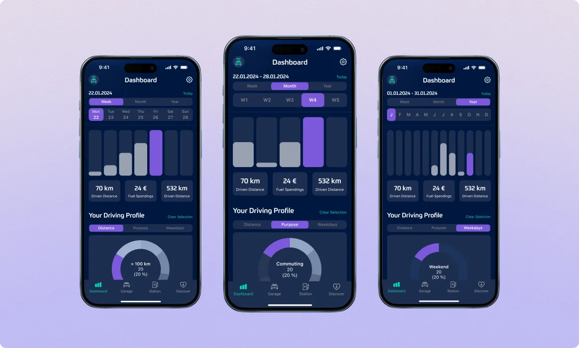
Once users were inside, the next surface had to earn the install. The Dashboard is the value moment, tracked kilometers in a histogram, metric cards for distance, fuel cost, and CO₂, plus a driving-profile gauge that ties the abstract data to a single recommendation. Same layout in three time scales (Week / Month / Year): week view is the daily check-in, year view is the savings story you take to a partner.
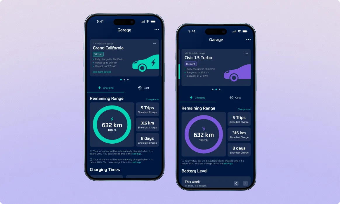
The Garage is where Lity stops being a tracker and starts being a decision tool. Users add their current combustion car and a virtual EV alongside it, a Civic 1.5 Turbo paired with a VW Grand California in the design comp. Each surface shows remaining range, charging times, trips since last charge, battery level. The numbers are honest, including the cases where the EV doesn’t win. Trust comes from showing the math, not winning it.
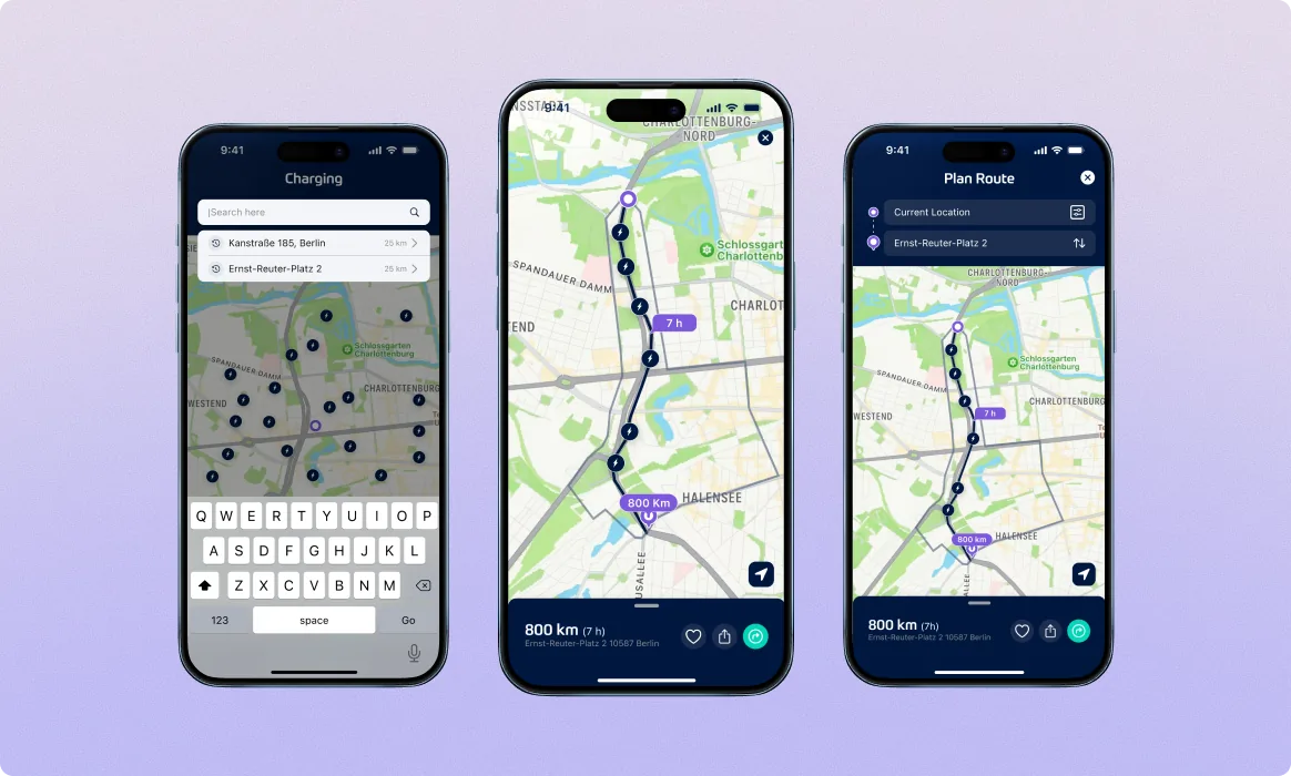
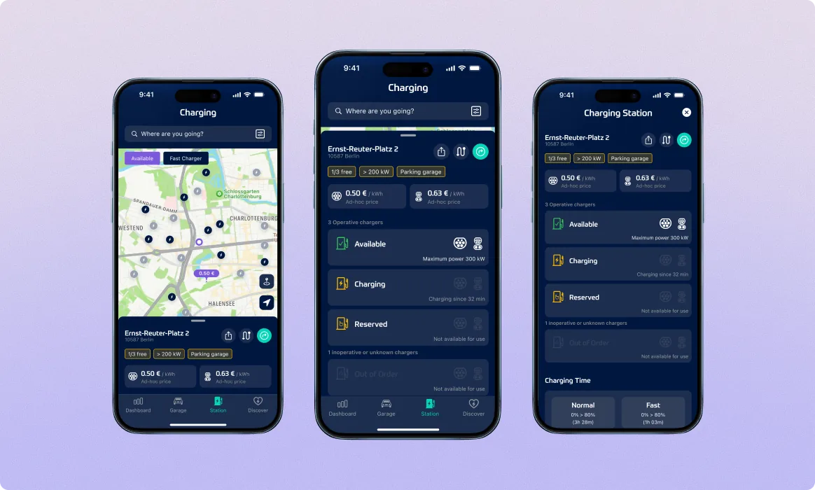
The biggest emotional barrier to EV adoption is range anxiety. The old app sent users to third-party apps to find chargers and plan routes, a context switch that broke the journey. We built one dedicated module combining search by destination, a live charging map, and a charge-aware route planner, plus a charging-session view for users at the plug with live status, time-to-full, and pricing per kWh. The platform owns the entire journey from “where am I going?” to “I’m at the plug.”
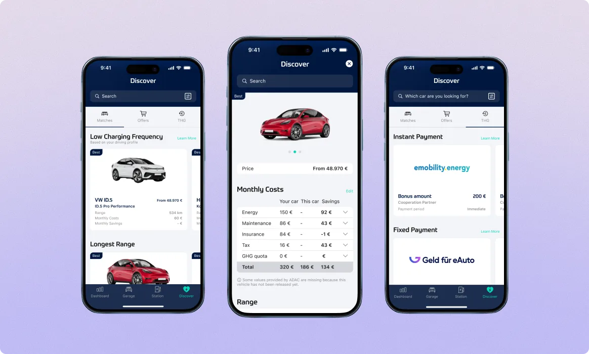
Tracking habits is half the product. The other half is letting the user act on the answer. Discover is Lity’s EV marketplace, models with prices, ranges, charging times, and a monthly cost breakdown derived from the user’s actual tracked driving. The detail page closes the loop: pick a Tesla and see monthly line items applied to your specific habits, plus financing options. Tracked driving became the input that drove every recommendation and every conversion path.
Drop-off from download to a key in-app interaction fell from 51% to 14%. 30-day retention rose to 11%. The Managing Director called it “a significant boost in user adoption” on a verified Clutch 5.0 review across every category. The redesign helped the team secure follow-on funding to expand across Europe.
Book a free sprintFive working days, a senior product designer embedded in your stack, redesigning the surface where your funnel leaks. If it doesn’t click, keep every file we ship.
A fintech SaaS that turns Excel chaos into a visual planning tool. Repeat client, the same team that brought us in for Lity came back.