


Imagine extending an in-house design team without replacing it.
Neuron is a Singapore-born micromobility leader, e-scooters and e-bikes across cities in SE Asia and Australia, certified carbon-neutral, designing and manufacturing their own vehicles for safety and sharing. They had a real product, a real customer base, and an in-house design team that already understood the system. What they didn’t have was enough designer-hours to keep up with feature growth. The brief: extension, not replacement.
Neuron is a Singapore-born micromobility leader operating fleets of e-scooters and e-bikes across cities, certified carbon-neutral, fast-expanding into new geographies. They had a real product, a real customer base, and an in-house design team that already understood the system. What they didn't have was enough designer-hours to keep up with feature growth. The brief was specific: extension, not replacement. Embed alongside the existing team, pick up flows in the sprint queue, hold the same Material-aligned bar across the rider app and the operator app.
One product designer slotted into Neuron's in-house team from day one, daily scrums, sprint meetings, strategy sessions, picking up flows alongside the in-house designers rather than taking them over. Inconsistent input fields and feedback patterns were a system problem, so we built Material-aligned primitives instead of inventing a new system. Snackbars replaced static banners with severity-tiered, dismissable, non-blocking feedback. Rider and operator apps both render the same fleet on a map, so we rebuilt the pin layer as a single visual vocabulary, vehicle type, battery level, status, with role-aware variations. One system, two audiences, faster incident triage on both sides.
Both apps had been built fast as Neuron expanded across cities. The system kept up; the design didn’t. Each app accumulated patterns from a different sprint and a different deadline. The audit named four: a cluttered home map where the rider’s 5-second jobs (locate, ride) were buried in competing UI; three different input patterns across forms, with different validation and accessibility regressions; static banners that blocked the ride, critical messages caught in the dismissal reflex; and an operator app that fell behind the fleet, with status hard to read at a glance.
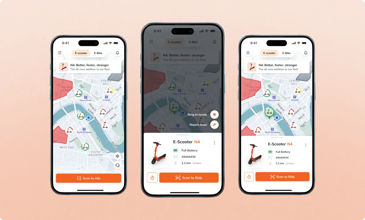
The rider’s home has two jobs in five seconds, show me where the vehicles are, and let me start riding one. The MVP filled the surface with competing UI. We replaced it with a floating panel that sits over the map and contains only the action affordances the rider needs in the moment. Tap a vehicle; the panel updates with the detail. Expand for a richer view; collapse back to a quiet bottom strip when scanning. Same surface, different focus depending on the moment.
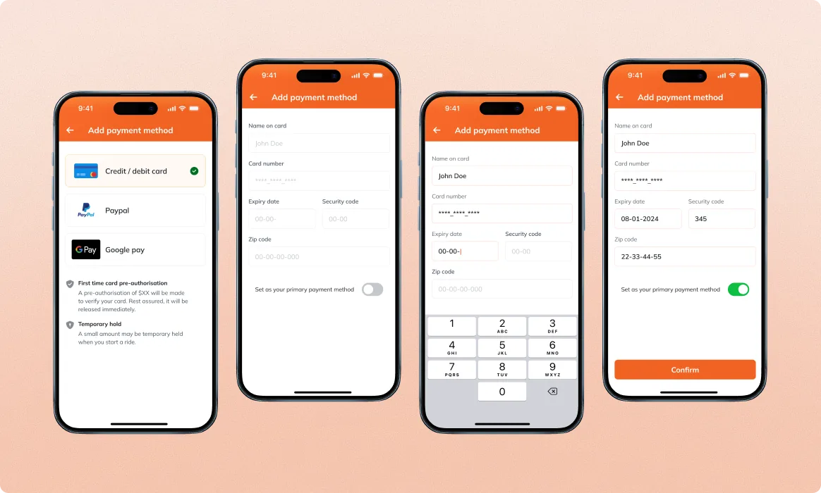
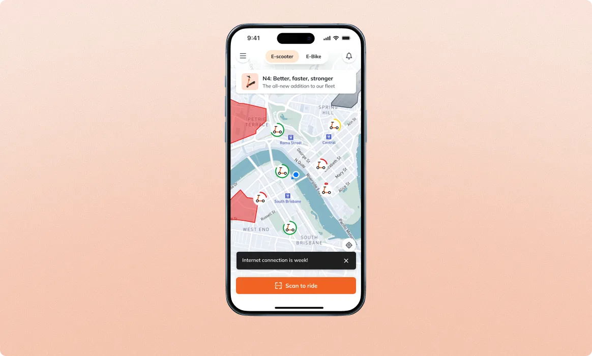
A consumer app feels consistent because of primitives, not just screens. We built two primitive layers Neuron didn’t have a strong system for, input fields and snackbar feedback, both grounded in Material Design. Industry-standard, accessibility-proven, engineers and designers already fluent in the conventions. Critical messages still earn the user’s attention; everyday messages stop interrupting the ride.
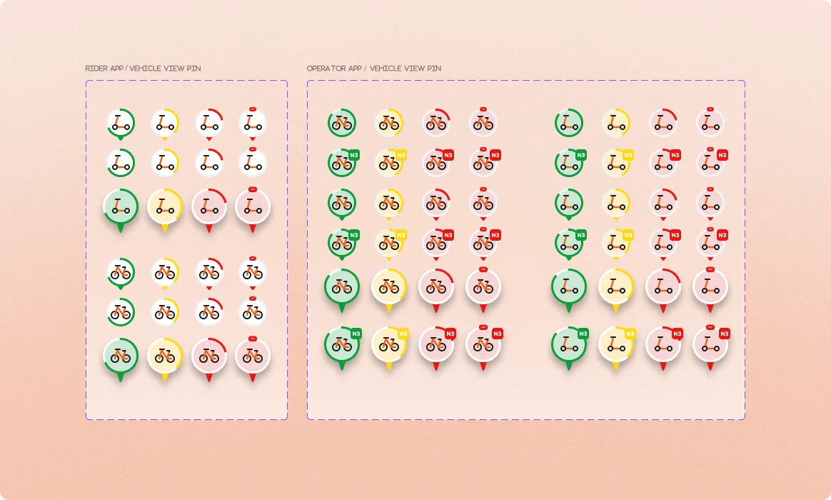
Rider and operator apps both render the same fleet on a map. The MVP had two different pin systems that didn’t encode the same information. We rebuilt the pin layer as a single visual vocabulary, vehicle type via icon, battery level via fill, status via color, with role-aware additions. The rider app surfaces ride-readiness; the operator app uses the same pins plus maintenance overlays. Both audiences read the same map and infer the same things.
Local service partners use the operator app for the unglamorous half of micromobility, battery checks, maintenance triage, vehicle relocation. We introduced a clean component-based layout with intuitive data viz, distinct vehicle-type icons, battery levels, and key status indicators visible without drilling in. The vehicle detail bottom sheet went through multiple structured iterations testing density vs. action prominence; the version that shipped balances both, and the surface holds up as fleets scale into the thousands.
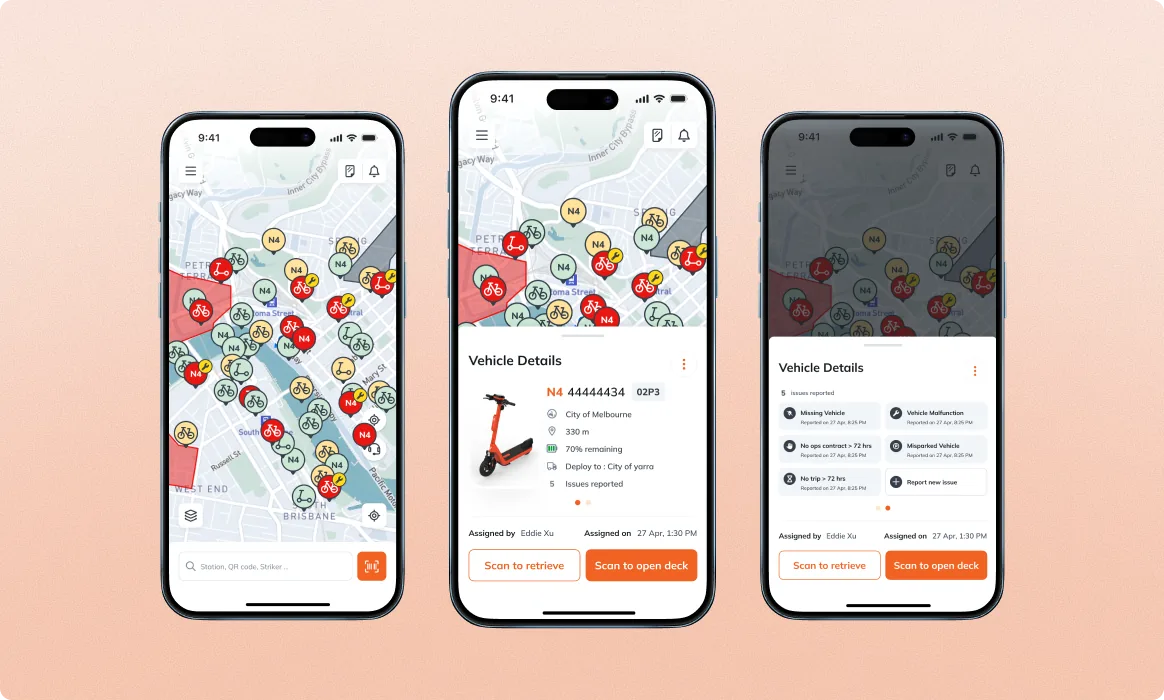
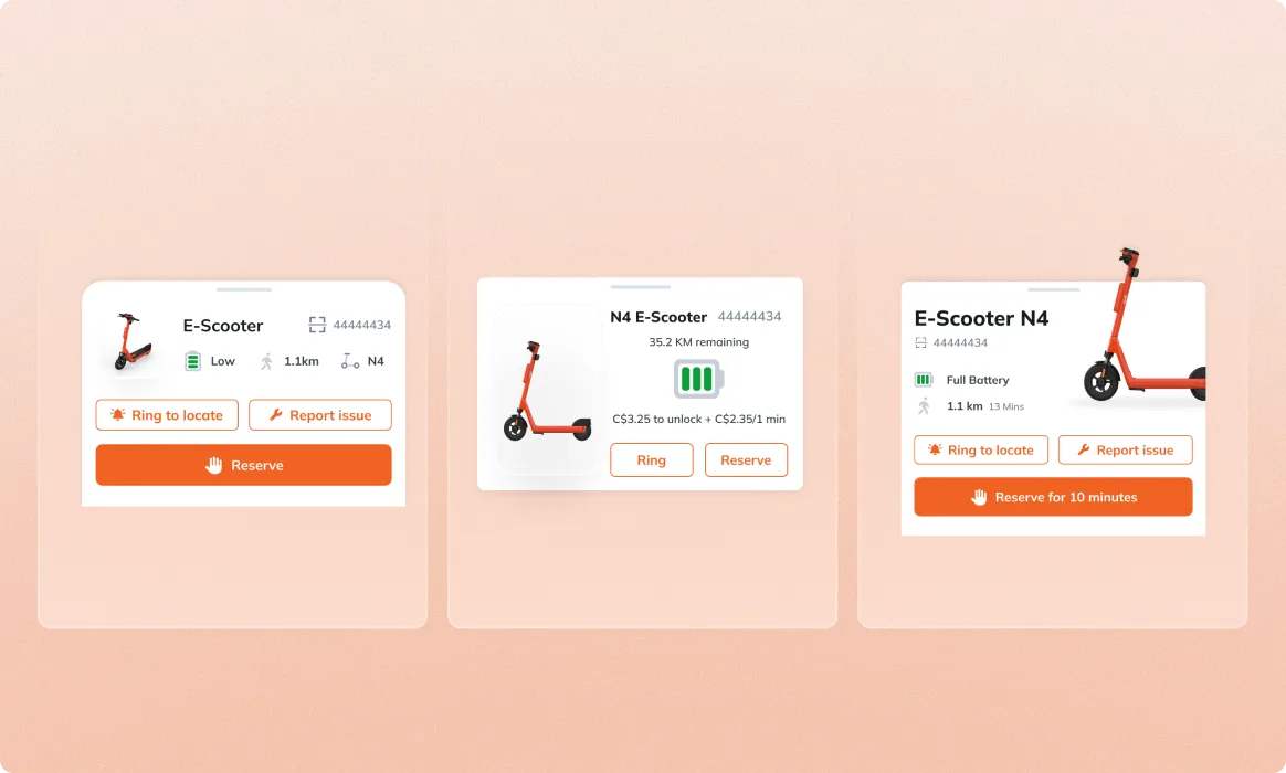
Neuron kept their in-house designers; we extended their capacity. The rider app got a floating-panel home, Material-aligned input fields, a snackbar feedback layer, and a redesigned vehicle detail; the operator app got the same primitives plus a clearer fleet view; and a shared MapView pin vocabulary tied both apps together. Two apps, one design language, one team that didn’t have to grow to keep up.
Book a free sprintFive working days, a senior product designer who slots into your existing process, daily scrums, sprint queue, the tools you already use. If it doesn’t click, keep every file we ship.
A German EV-adoption mobile app, the designer Lity picked had prior fleet-management chops from this Neuron engagement. Verified Clutch 5.0, follow-on funding secured.