


Imagine the operational stack of a 5M-transaction remittance fintech, rebuilt under one design system.
HomeRemitt is a South African remittance fintech moving money home across 30+ countries. When they came to us the customer app was clunky, the agent network had no dashboard at all, and the marketing site read like a brochure. We rebuilt all three in parallel, one embedded design pod, one design system underneath, and a multi-product scope earned in the first founder meeting.
HomeRemitt is a South African remittance fintech moving money home across 30+ countries. Customers had a slow, dated mobile app. Agents had no dashboard at all (everything ran on manual processes). The marketing site read like a brochure. The HomeRemitt CEO flew in for the kickoff. Trust earned in the room. The engagement scoped out as a multi-product rebuild from day one.
We built the design system before any screens, then drew customer app, agent app, and marketing site in parallel against the shared vocabulary. The customer-facing app got a calculator-led home, an eight-step send flow with transparent fees, beneficiaries with three transfer-type icons, and a trust-surface transactions list. The agent app was built from zero with an in-app AI assistant. The marketing site rebuilt around a live rate calculator instead of a tagline. Today: 250K+ customers, 5M+ transactions, 4.9 stars on the App Store.
Customer app (calculator-led home, eight-step send flow, beneficiaries, transactions). Agent app from zero (home, AI assistant, dashboard). Marketing site rebuilt around a live ZAR-to-recipient-currency rate calculator. Mobile-responsive across every flow.
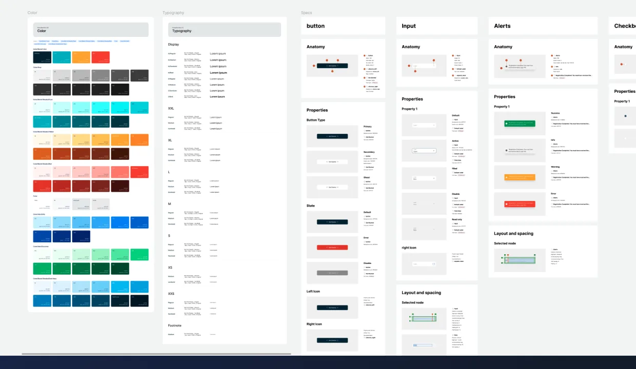
Color palette, type scale, spacing, every component and state defined up front. Three coherent products instead of three drifts. The system is the deliverable HomeRemitt’s in-house team carries forward; new surfaces ship today against the same vocabulary.
HomeRemitt’s rails worked, money moved, partners settled, but the surfaces customers actually touched hadn’t kept up. The old mobile app was slow and visually a generation behind. The agent network ran on manual processes with no dashboard. The marketing site read like a brochure. The brief was simple in shape and big in scope: modernize what customers see, build what agents need, and make the website do real conversion work.
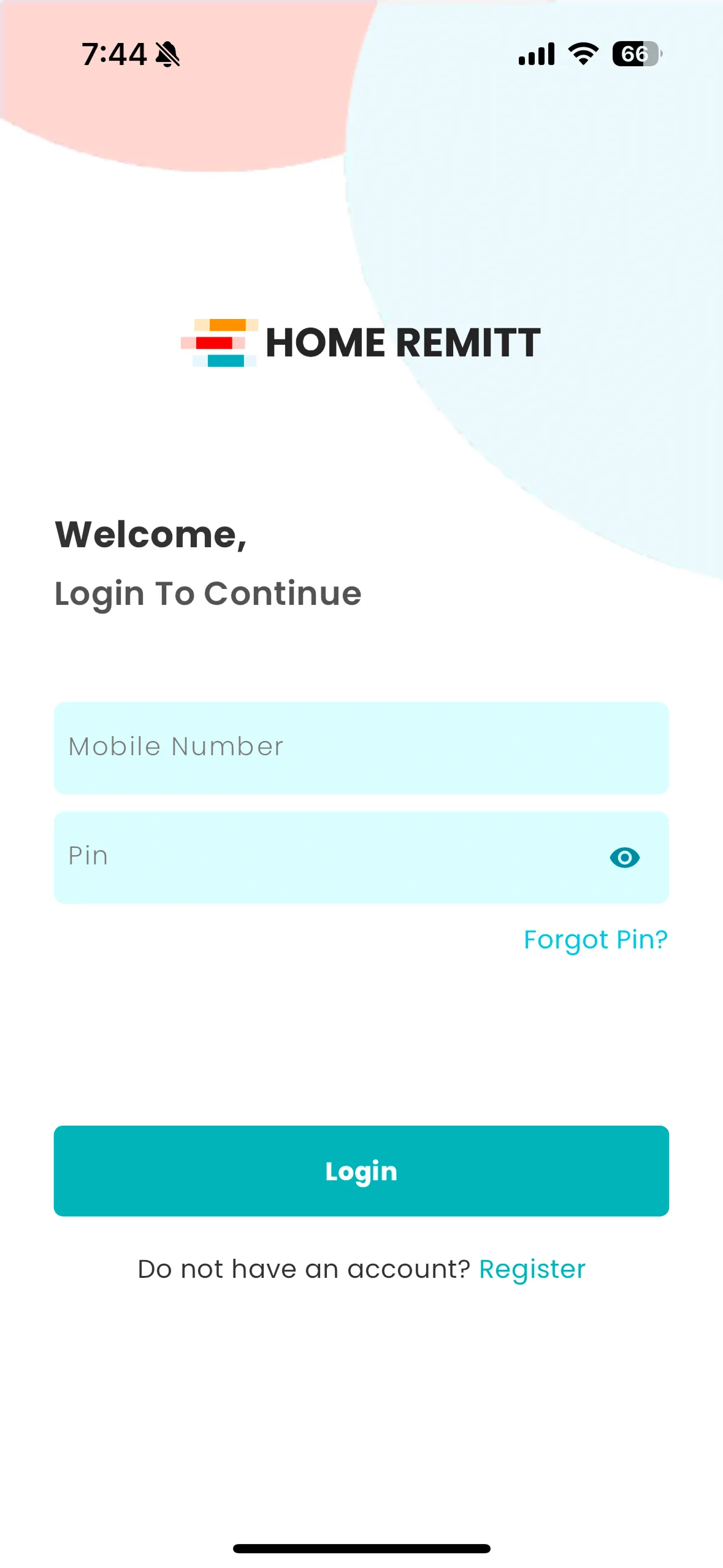
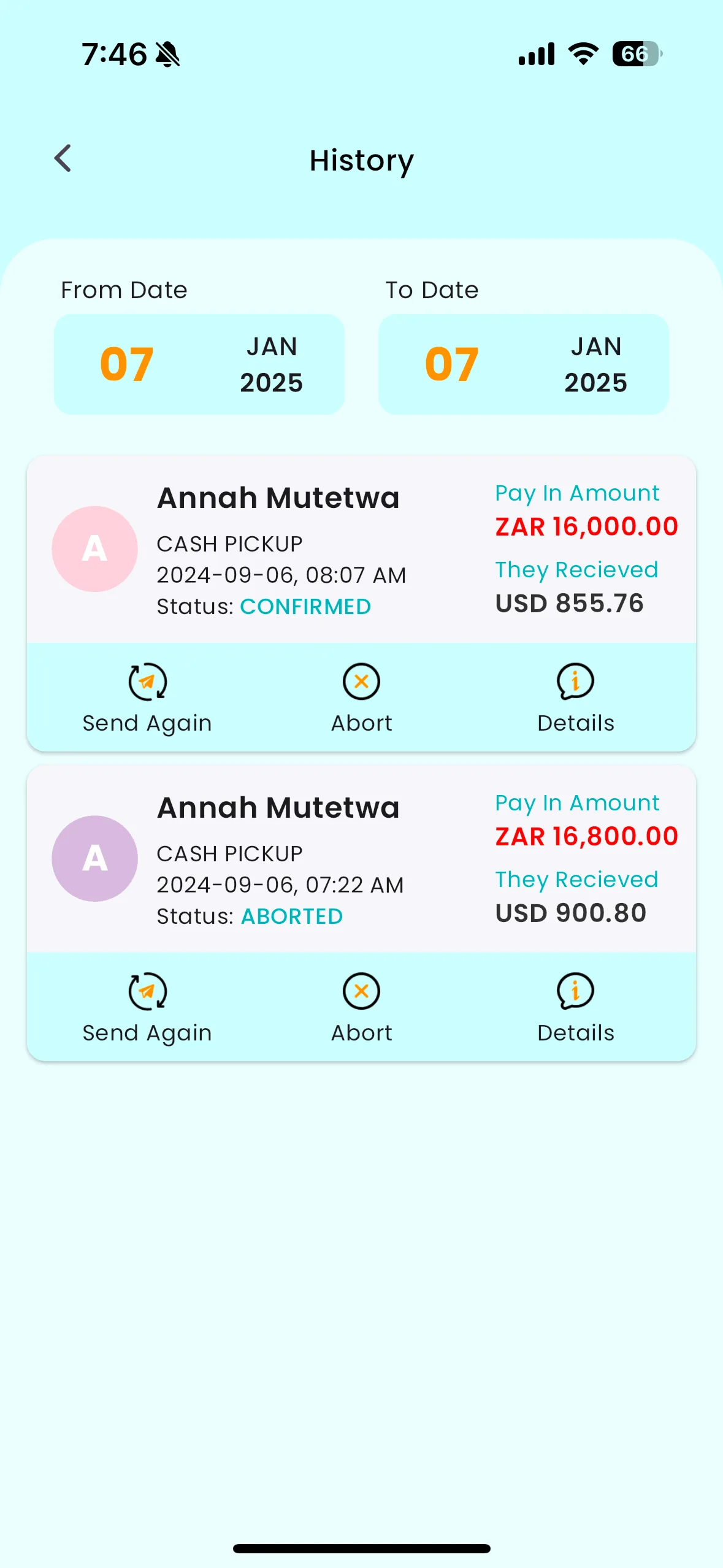
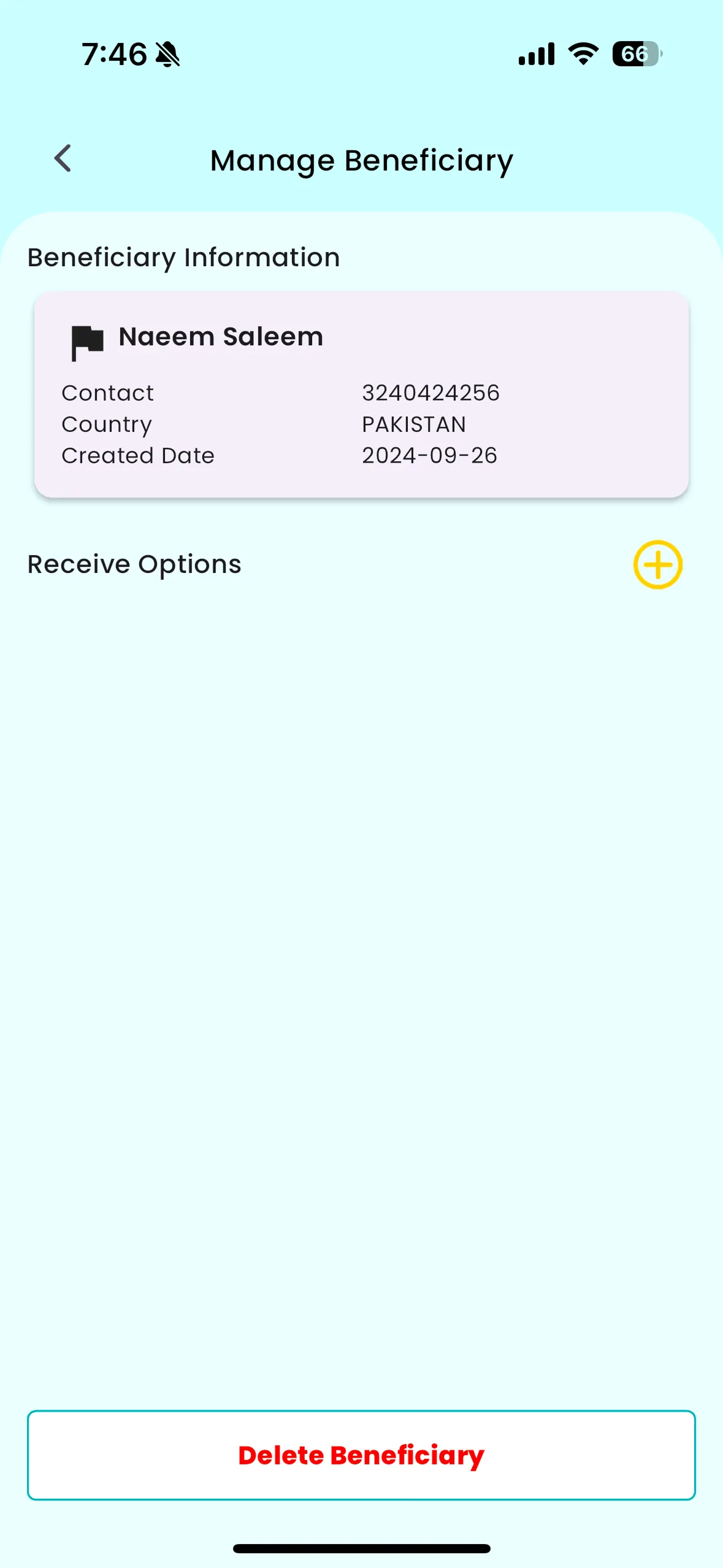
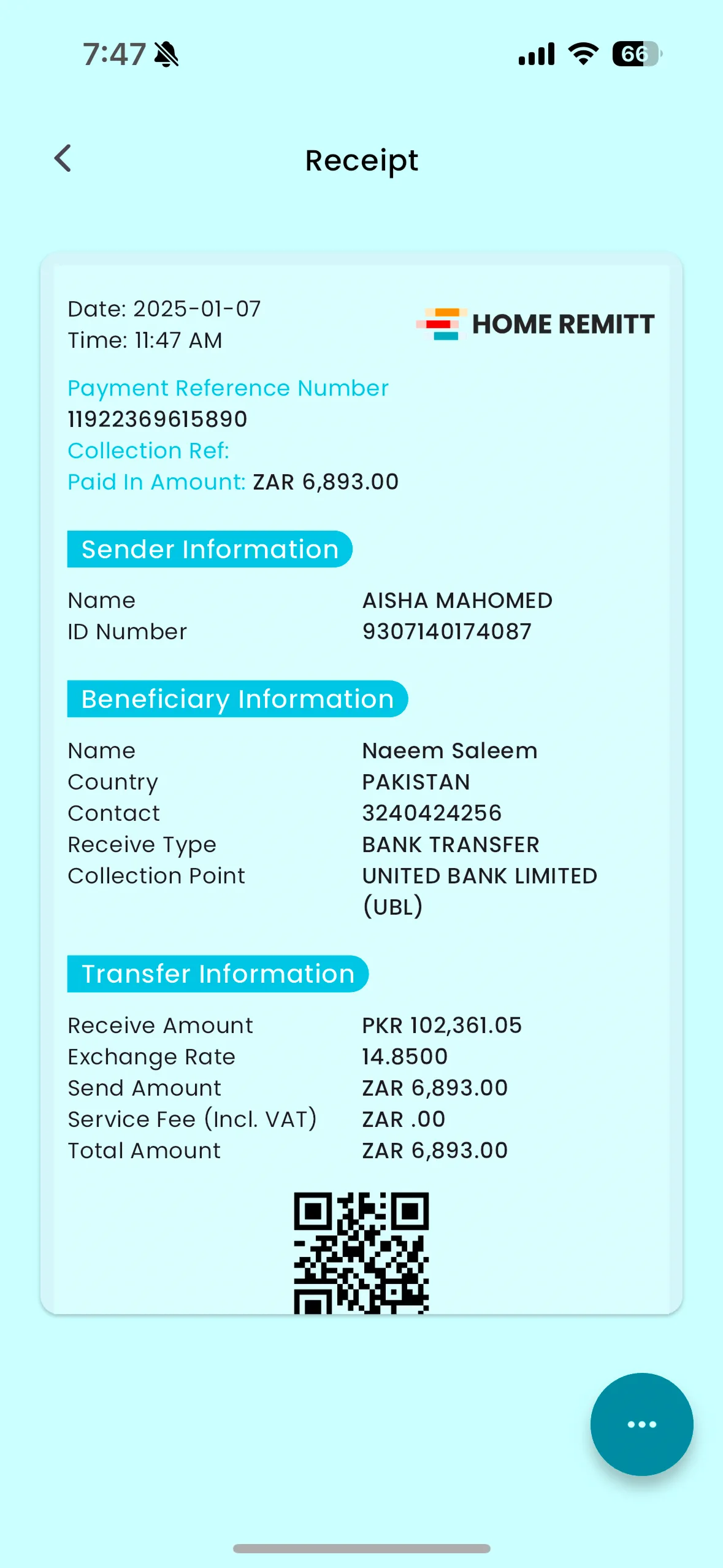
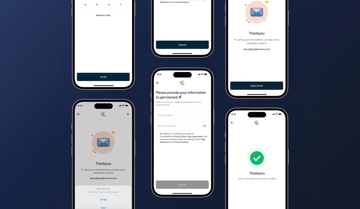
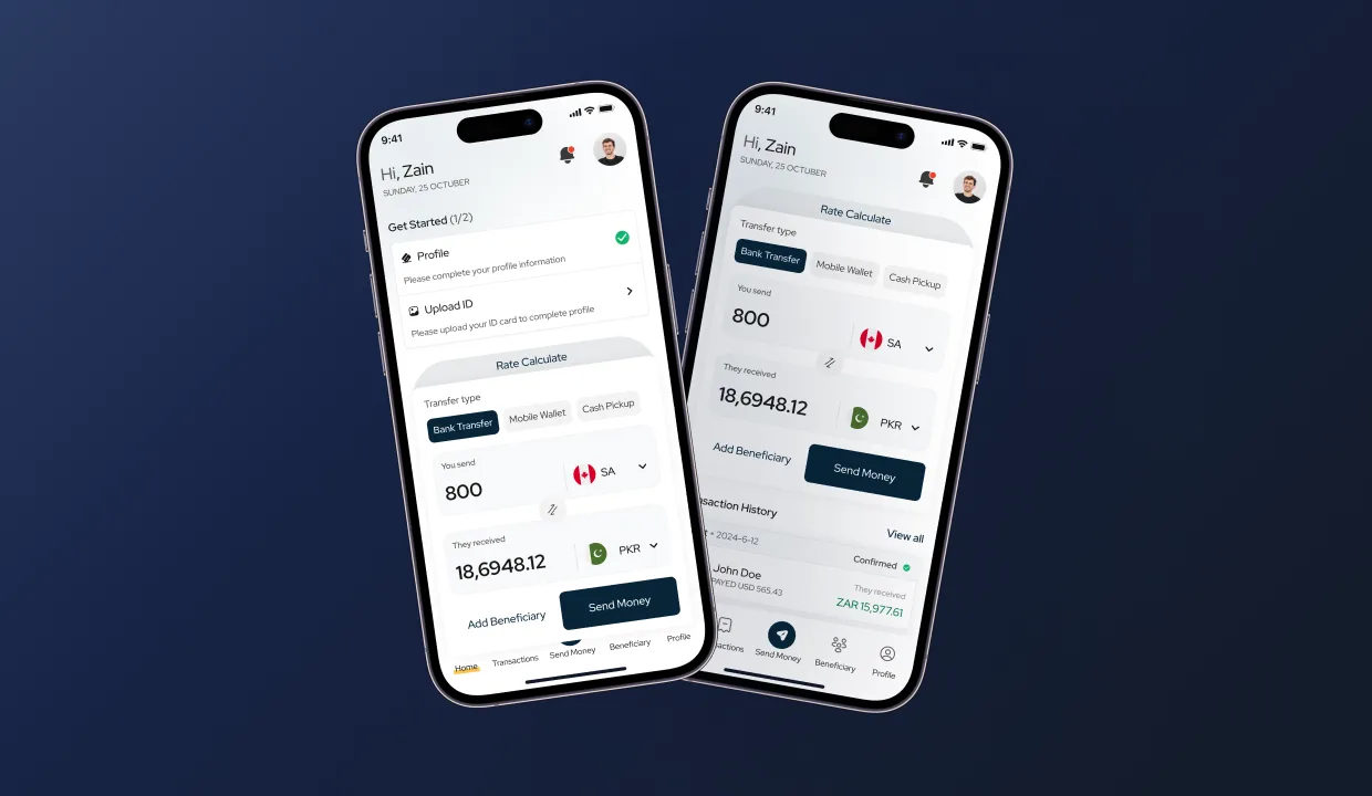
Registration is where remittance apps lose people. We ask only what compliance actually requires, name, country, contact, email, ID, date of birth, and defer everything optional to a soft profile-completion banner on the home screen. So a new user can be sending in seconds and finish KYC after. The home screen does double duty: rate calculator at the top, transfer types front-and-centre, recent transactions one card down, plus the KYC nudge.
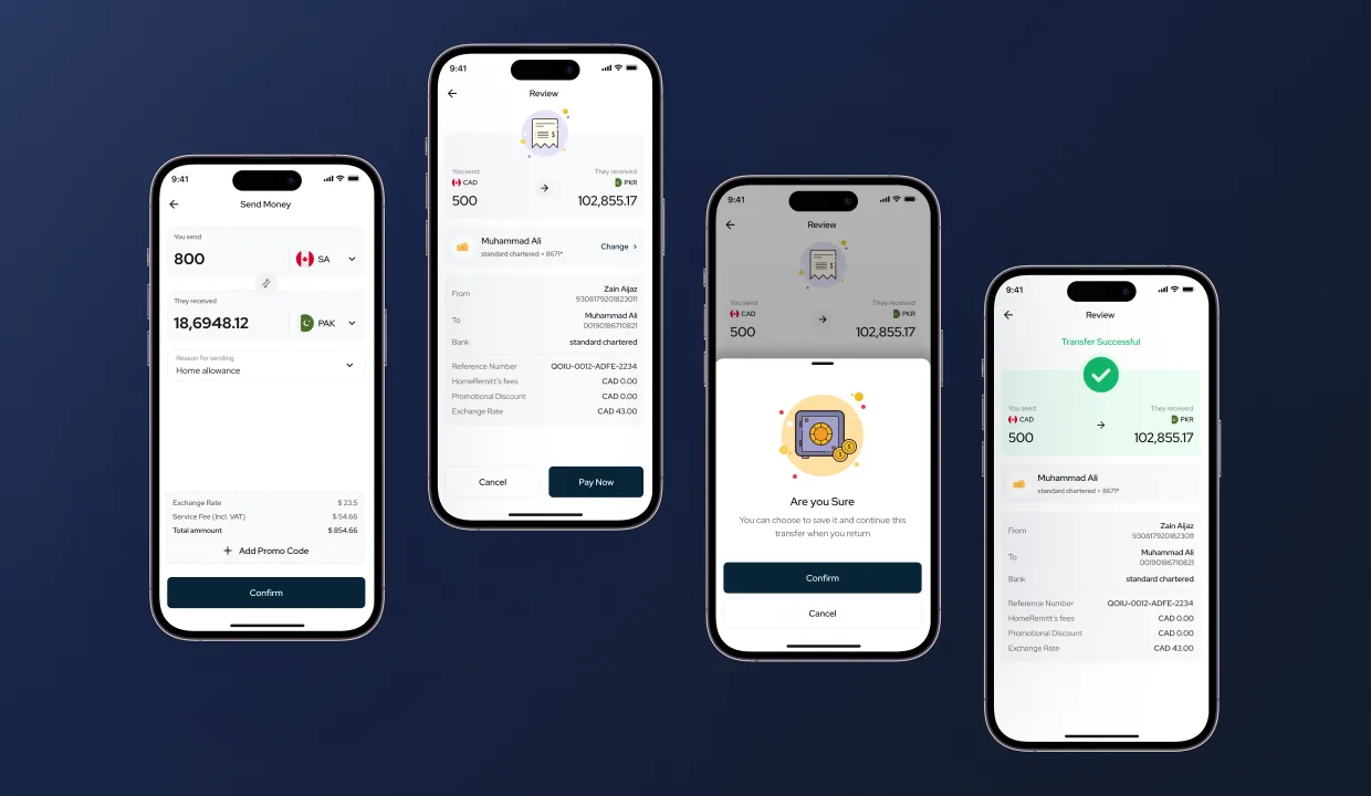
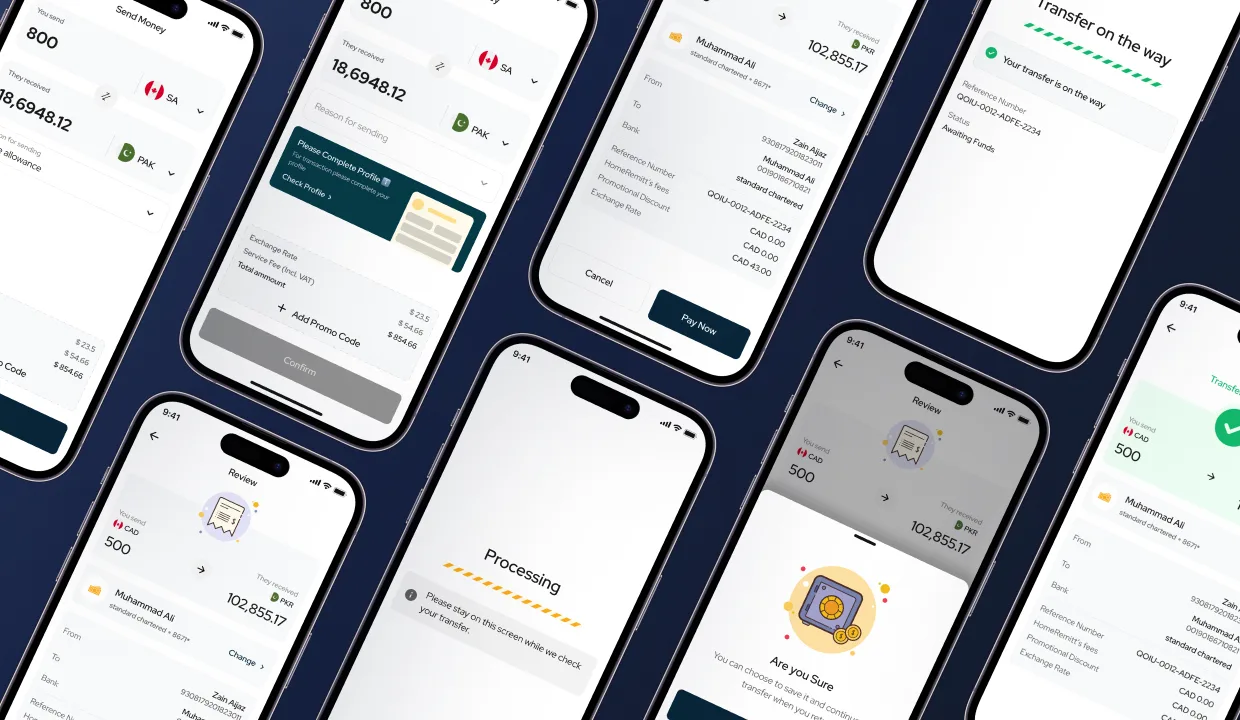
Send-money is the surface every other surface exists to support. We rebuilt it as a single linear flow, type in, beneficiary picked, currency previewed live, fees broken down, profile and limit checks inline, then review and pay. No back-tracking, no surprises at confirmation. The system carries the cognitive load: limit too high? Banner explains and offers the cap. Profile incomplete? Banner offers the missing field instead of dead-ending the flow.
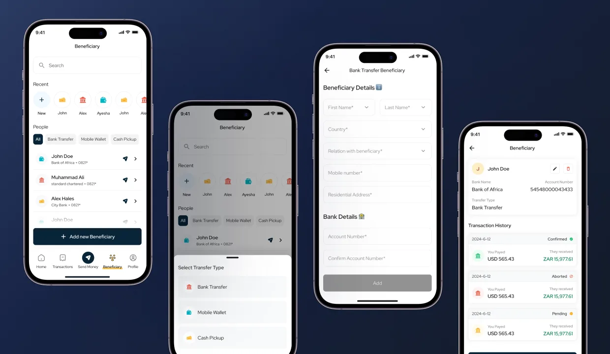
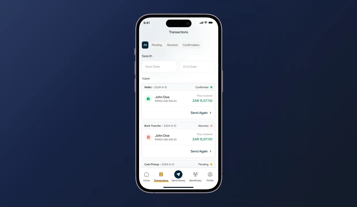
Beneficiaries lists every recipient with three transfer-type icons (bank transfer, mobile wallet, cash pickup) so the right path resolves at a glance. Transactions is the trust surface: complete history in one place with pending / terminated / canceled filters and stacked cards showing recipient, amount, type, status. Customers stop calling support to ask “did it go through?”, the answer is in the app, in the right state, on the right card.
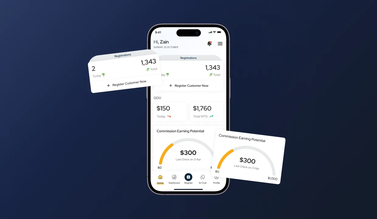
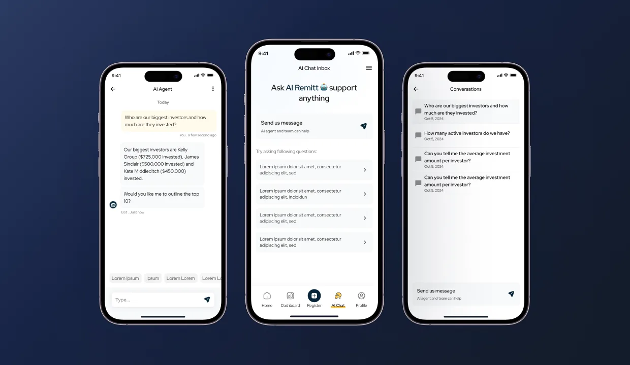
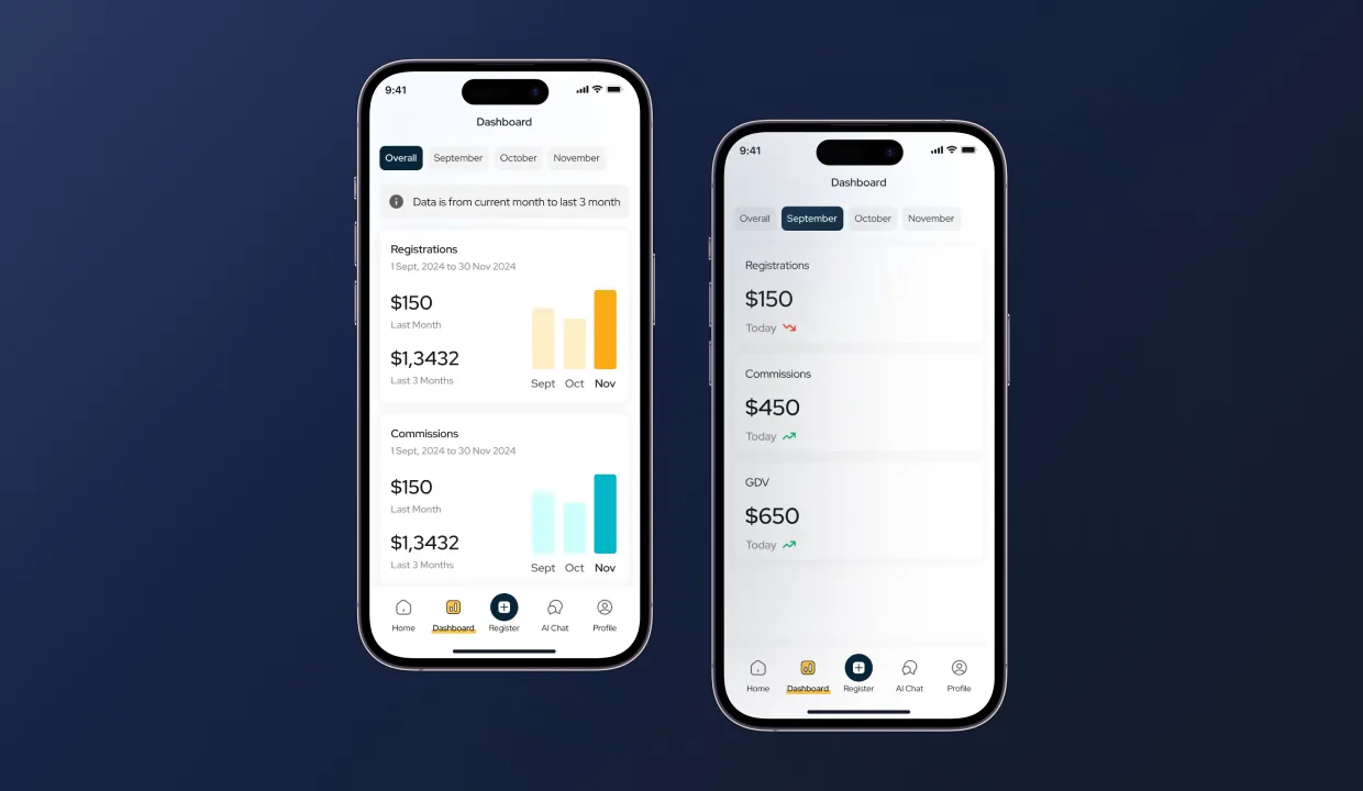
HomeRemitt’s agent network had been running on manual processes. We designed an agent home screen built around the three numbers an agent actually checks first thing in the morning, registrations, monthly GDV, and a commission meter that fills as they earn through the month. The same app carries an in-app AI assistant with suggested prompts and platform-aware answers trained on HomeRemitt’s docs, plus a 3-month trend dashboard for the data.
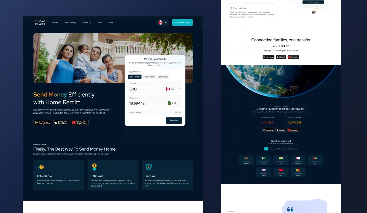
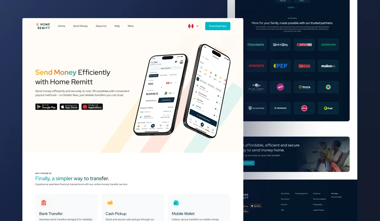
Competitor research surfaced the same gap on every comp: a live rate calculator on the homepage. We made it the hero. ZAR in, recipient currency out, payout method toggled inline. Below the calculator: three USPs (affordable, efficient, secure), four easy steps to send, supported countries by region, KPIs (250K+ customers, 5M+ transactions), an FAQ, and a dedicated send-money page that lets users jump to country-specific guidance. About-us and contact-us went from missing to first-class. Mobile-responsive end-to-end.
Three products without a shared system don’t hold together. We defined HomeRemitt’s color palette, type scale, spacing, every component and every state, then built the screens against the system rather than the other way around. The system became the deliverable HomeRemitt’s in-house team carries forward; new surfaces ship today against the same vocabulary.
The customer app is faster and easier. The agent network has a dashboard, a commission meter, and an in-app AI assistant where there used to be manual ops. The marketing site converts. Three products, one system, one platform now serving 250K+ customers and 5M+ transactions across 30+ destinations, per the live homepage today.
Book a free sprintFive working days, a senior pod inside your product on a real surface, design + system + flows your team keeps. If it doesn’t click, keep every file we ship.
A consumer mobile app for Lity, the team came back for a second product (Finwize) on the back of this work. Verified Clutch 5.0 from Alexander Back.