The feeling of watching your product get zero response even though you created stunning designs, cool interfaces, and used innovative technology is super frustrating. As a result, to prevent this from happening, it’s best to stick to the laws of UX while building and designing your digital platform.
These laws will not only help you create flawless products but also educate you about the psychology and mindset of users while they interact with your product. Therefore, it’s super important to follow them to create winning products.
Let’s have a look at them together.
Avail
Free SaaS UX Audit Checklist
Ultimate UX Audit Checklist compiled by Top-rated UI/UX design professionals on how to make your SaaS app amazing.
What are UX Laws?
Laws of UX are essential instructions to guide designers while they are creating a digital product’s interfaces. These were originally introduced by a product designer, Jon Yablonski, in his book, which every designer should know.
These principles are created by keeping the user’s psychology in mind so that they align with their unique needs and preferences. These are rules of good UX that can help you build products with intuitive design and user-friendly interfaces.
They have valuable insights that ensure you create products that not only enhance and optimize the user experience but also efficiently meet the special needs of users. Following these standard guidelines can help users create winning designs that fulfill their expectations.
Laws of UX to Keep in Mind
Here are some of the most important laws of UX to keep in mind while creating designs and interfaces if you want users to stay hooked to your platform.
1. Jakob’s Law
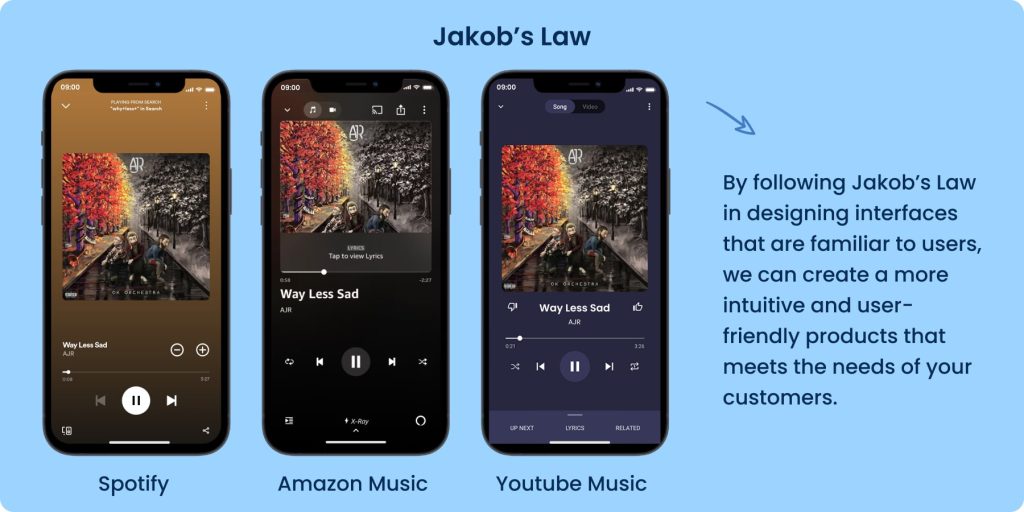
Principle: Go for interfaces that are similar and to which users are already familiar.
In simpler words, people are creatures of habit. They tend to stick with what they know rather than try something new.
Let’s say you’re designing a new smartphone app for social networking. You’ve noticed that many popular social media apps have similar features, like news feeds, messaging, and profile pages.
Instead of trying to come up with a completely different approach, you decide to stick with what users are already familiar with. You make it easier for them to understand and use your app by using a layout and features that people are used to.
For instance, you can look at the music apps Spotify, Amazon Music, and YouTube Music. They have the exact same layout, icons, CTA buttons, and even similar micro interactions because that’s what people expect from them.
This approach not only saves you time and resources but also ensures a better experience for your users. They can navigate the app smoothly, connect with friends easily, and enjoy using it without having to learn everything from scratch.
You can create a more user-friendly and intuitive app that meets the needs of your audience by following this principle of familiarity. It all revolves around making things easy for your users by giving them what they already know and are comfortable with.
2. Aesthetic-Usability Effect
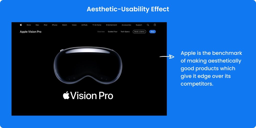
Principle: Sites or apps that look great are assumed to perform well.
We all know that the first impression is the last impression. That‘s the drill because users think that if it looks good, it works well too. There’s actually science behind these kinds of UX laws. Studies show that how nice something looks can make people think it’s easier to use. But that doesn’t mean you can skimp on user experience or design quality.
Take the example of Apple. Their success lies in their focus on creating such aesthetically appealing products that the users end up ignoring their flaws.
Your design should focus on both style and substance, as there’s a clear link between how good something looks and how much people like using it. This is one of the laws of UX design, which is all about finding that sweet spot where your app or website not only looks great but also works like a charm.
3. Doherty Threshold

Principle: Human-computer interaction is ideal when the interaction pace is less than 400 ms so that no one has to wait for the other’s response.
The Doherty Threshold is all about keeping your users engaged by reacting quickly. It’s like letting them sit on the steering wheel. They feel more in control and are more likely to stick around when users see instant responses to what they do.
A good trick is to respond within a second of whatever they do. If it takes any longer, they might start thinking your design is sleeping on the job. Even if stuff’s happening in the background, keep users entertained with progress bars or animations. It’s like giving them a little show while they wait so they stay hooked and happy.
This is one of the important rules of good UX, and it is being used extensively. For instance, a computer program called Pocket shows the user a progress indicator while they are waiting for the page to load.
4. Fitts’s Law
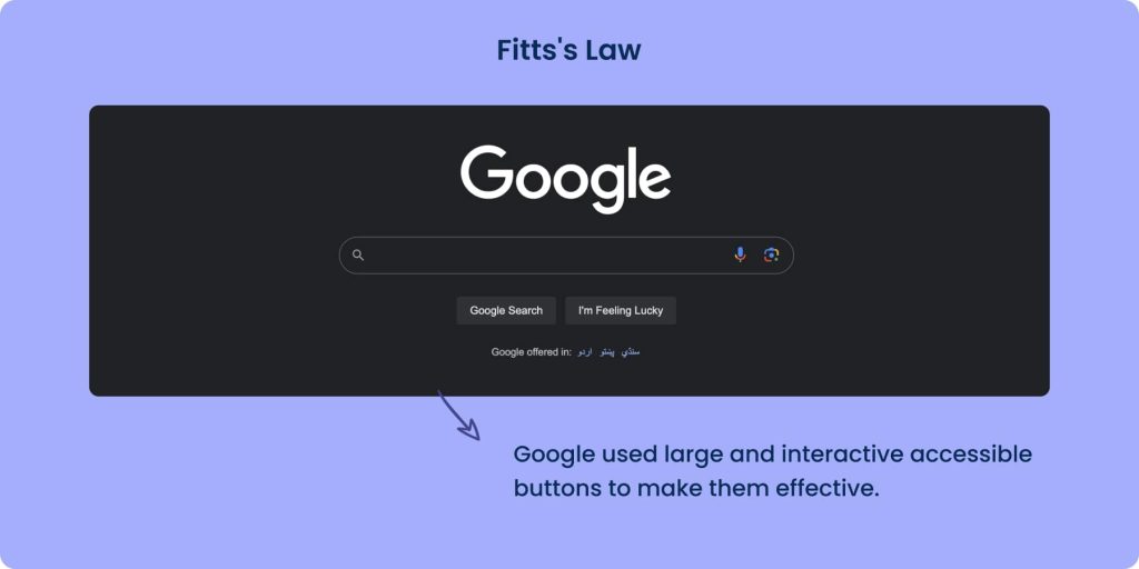
Principle: The primary action should be easily accessible to the user in both reaching it through travel and target size.
Fitts’s Law, named after psychologist Paul Fitts, is about making things easy to use in your design. This is one of the most important laws of UX.
Here’s what it’s all about.
- Make buttons big enough to tap easily and give them space so users don’t tap the wrong thing.
- Keep action stuff separate so it’s easy to find.
- Make sure everything is clickable so users don’t have to be super precise.
- Keep everything within easy reach.
Your design becomes more user-friendly and simpler for people to get things done by following Fitt’s Law in UX.
For example, Google places its search bar in the middle of the screen and menu options in the top corners. This uses special spots on the screen that people are drawn to and likely to click.
The “Google Search” button sits right under the search bar, and you can click anywhere on the button. This makes it easy to understand and use, which is how people think about searching online.
Next to the “Google Search” button is another one called “I’m Feeling Lucky.” It’s like a bonus option and is grouped with the search button, so it’s easy to find.
5. Hick’s Law
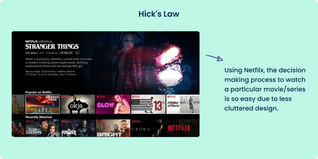
Principle: The more options a user has, the longer they will take to make a decision.
Imagine you’re at an ice cream shop with a ton of flavors to choose from. It’s like being stuck in line forever, trying to decide. Too many choices can be overwhelming and take the fun out of it.
Or think of going to a restaurant with a gigantic menu. You end up hungry and still unsure what to order after reading through it all. It’s frustrating and ruins the meal experience.
As a UX designer, you don’t want to bombard users with too many options. Keep things simple and clear so they can make decisions quickly and easily. That way, they’ll have a better time using your product, and they’ll want to come back for more!
Just like Netflix. See how they limit the number of TV shows and movies displayed on the home screen and movies to reduce clutter so that the user can pick an option quickly.
6. Miller’s Law

Principle: The average person’s immediate memory store is just “7 chunks of information”.
When we use a new app or website, our brain learns how to navigate it. But our brain can only remember a few things at once. That’s where Miller’s Law comes in. It says we can only hold about 7 pieces of information in our head at a time.
Therefore, we need to follow the laws of UX like these to keep things simple. Too many choices, confusing layouts, or too much information at once can overwhelm users. For example, big numbers like phone numbers are easier to read when they’re broken into smaller groups.
To make interfaces user-friendly:
- Don’t give users too many options.
- Make things easy to understand.
- Keep things clear and organized.
- Break down information into smaller parts.
- For example, many companies use mnemonic phone numbers so that users can easily remember their numbers. Take the example of Holiday Inn, which has a toll-free direct reservation line 1-800-H0LIDAY (+1-800-405-4329). This number with letters is easy to remember.
Following these steps helps create interfaces that are easy for people to use and understand. Your user will only use their memory for the important elements of your interface.
7. Goal-gradient Effect
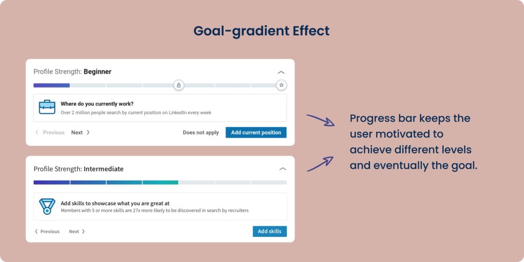
Principle: Users will complete an action fast when they are closer to their goal.
This is one of the rules of good UX, which was coined by behaviorist Clark Hull in 1932. This UX law mentions that no matter how far users have come, they are motivated to complete tasks when they see how much is left to reach the target.
As designers, you can leverage the goal-gradient effect by highlighting the remaining steps to motivate users. The visual representation of the progress they made, the amount that is left, and the reward at the end will offer clarity to the user and encourage them to complete it.
A prime example of the Goal Gradient Effect is seen in the “Profile Strength” feature on LinkedIn. When you see that progress bar moving towards completeness, like when it says “Intermediate,” you feel motivated to keep going and finish your profile.
8. Law of Common Region
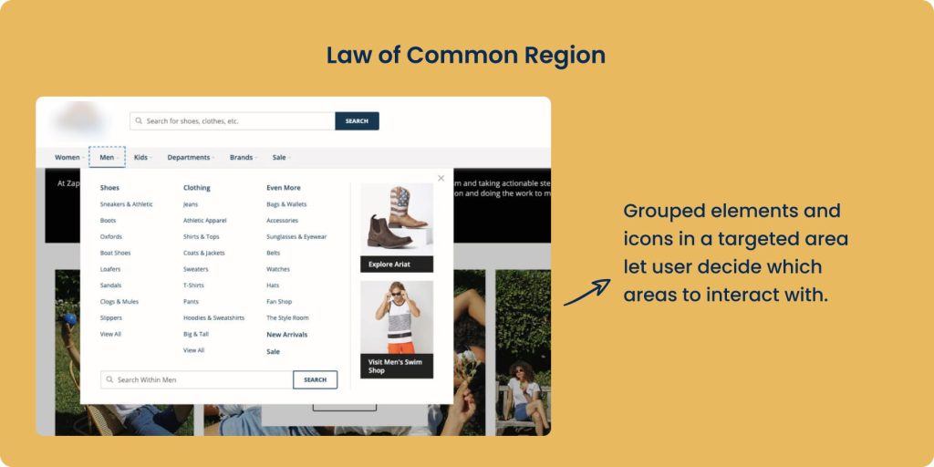
Principle: Users tend to cluster elements that are within a specific boundary.
Users make judgments when they see a design to spot grouped elements and icons in a targeted area so that they can decide which areas to interact with.
As a result, keeping these laws of UI and UX in Mind, designers can create common regions for interactive designs by
- Adding shading to a set of elements
- Incorporating background colors
- Labeling elements in the header, footer, and navigation panel
An example of this can be seen in Hubspot’s mega menu, where in the resources, all the educational material like blogs, Ebooks, guides, free courses, certification, and other topics like What Are Inbound Marketing and INBOUND 2024 are grouped. Moreover, it also has other clusters like user resources, services, etc.
9. Law of Proximity
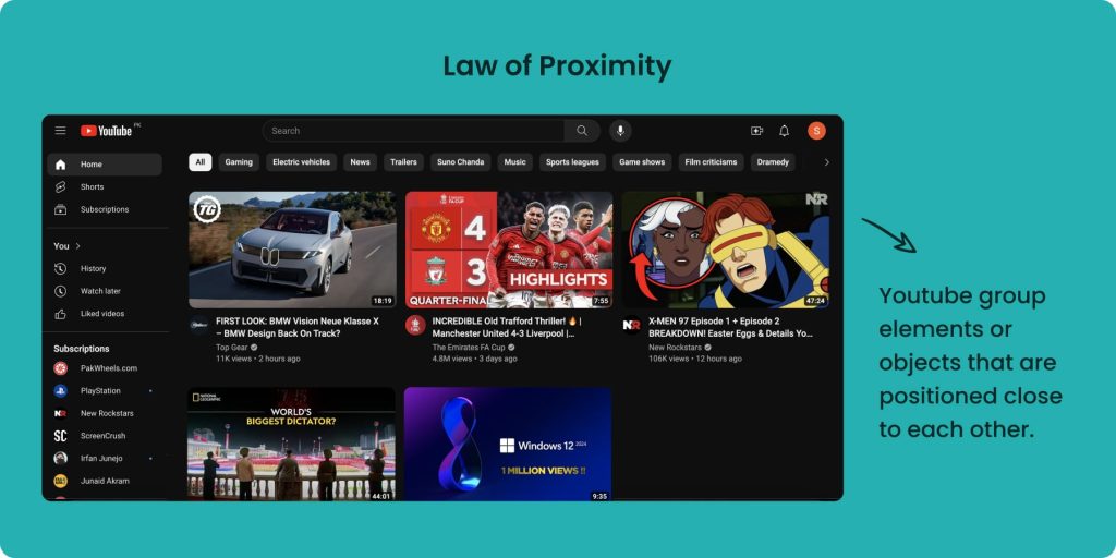
Principle: Users group elements or objects that are positioned close to each other.
The Law of proximity is all about placing them proximate or adjacent to each other and regarded by users as connected or grouped.
They are perceived as a group, which gives a sense of unity and makes it easy for users to interpret and make sense of the information or message that is being conveyed. Therefore, while creating interfaces, designers should keep UX laws like this in mind and place related items together.
Just like YouTube places the Thumbnail and text proximate to show that they are interrelated. Moreover, there is adequate white space between the rows, which helps users to differentiate between every element without going hard on the eyes.
10. Law of Uniform Connectedness
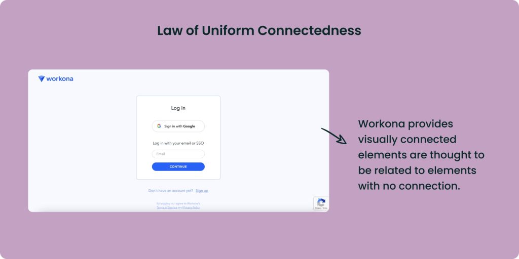
Principle: Visually connected elements are thought to be related to elements with no connection.
When elements are visually linked, people tend to think they’re more related compared to elements without any connection.
This principle is about grouping things based on visual cues. Users naturally see elements that are grouped as being connected. Designers should use visual cues like similar shapes, frames, or colors to group related elements to meet the users’ expectations.
For example, the login screen from Workona relates elements for signing in, which are grouped within a white box.
11. Law of Prägnanz
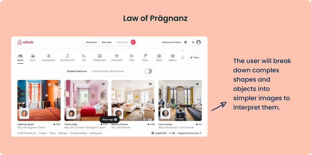
Principle: The user will break down complex shapes and objects into simpler images to interpret them because this takes cognitive effort.
Our eyes simplify complex shapes to reduce cognitive effort, following the principle of. When encountering unfamiliar shapes, we instinctively break them down into simpler forms. This Law highlights our preference for simplicity to avoid overwhelming ourselves with information.
Prägnanz’s Law is one of the laws of UX, which is important to keep in mind while designing interfaces to make them simple and user-friendly. It’s advisable to employ simple shapes when designing interfaces so that users can perceive them straightforwardly.
AirBnB has mastered the Law of Prägnanz as they use simple, clean, minimalistic cards and boxes in their layout so that users can easily book accommodations.
12. Law of Similarity
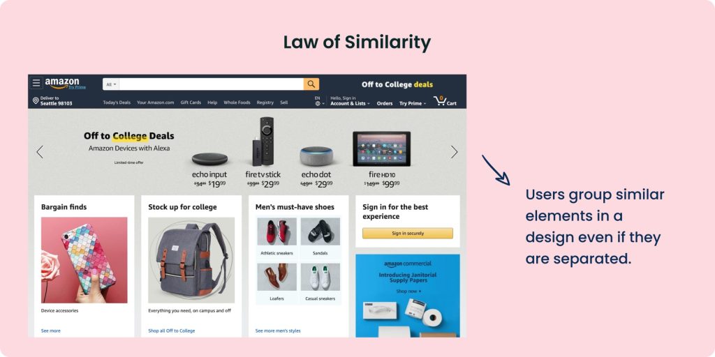
Principle: Users group similar elements in a design even if they are separated.
In UX design, the Law of similarity says that things that look alike are thought to belong together. This is because our brains like to organize similar-looking stuff.
For example, if a website has lots of buttons and they all look exactly the same, it can be hard for users to tell them apart. But if buttons that do similar things look similar, users find it easier to understand.
This is one of the laws of UX, which also helps create a clear order. Designers can show users what’s most important by making some things stand out through different colors or shapes.
You should make the interface simple for users by picking the same color, fonts, icons, and buttons for elements that perform similar functions. This way, users can easily figure out what goes together and how to get around.
For example, Amazon uses similar fonts and styles in the items displayed on its website so that users know that they belong to the same category.
13. Occam’s Razor
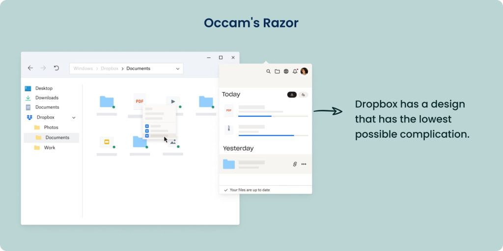
Principle: Go for a design that has the lowest possible complication
Occam’s razor is one of the most important laws of UX when it comes to choosing a design that is simple and effective. The aim is to select a design which is simple and has no complications.
Designers should pick a prototype that is the most easy to interpret. If such a prototype option doesn’t exist, you should make one. As the German designer Dieter Rams says: “Good design is as little design as possible.” It’s just like the KISS rule, which says, “Keep It Simple, Stupid!”
A real-life application of Occam’s razor is Dropbox, which makes it easy to share files. You just drag and drop what you want to share, and it’s done. They keep it simple so everyone can understand and use it easily. This helps people work together better and get things done faster.
14. Pareto Principle
Principle: 80% of the results come from 20% of the work.
The Pareto Principle is one of the laws of UX that is applicable not only in the design industry but also in many fields, not just design. It’s helpful for projects with limited time or resources.
This rule is all about focusing on designing things that will help your audience the most. For example, when making a basic version of a product (MVP), designers create simple prototypes that show most of what’s needed without needing a lot of work.
Additionally, UX designers can use this idea to decide which features to focus on first, choosing the ones that will make the biggest difference.
The Pareto principle’s authenticity can be accessed by looking at a 2002 report from Microsoft, which stated that “Many problems in Windows and Office happen because of just a few types of bugs. About 80% of the errors and crashes come from only 20% of all the bugs found.”
15. Parkinson’s Law
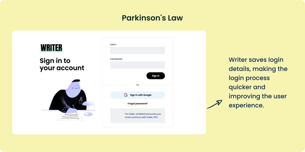
Principle: A task takes up all the available time.
This is one of the essential laws of UI and UX, which emphasizes increasing the interface’s productivity for enhanced user experience by reducing the time required to complete a task.
For instance, suppose the checkout task takes 4 minutes on average. If you end up building an interface that enables the user to complete the task in less than this time, it will count as a positive experience. Parkinson’s Law is not only famous among UX-ers but also among productivity enthusiasts.
Take the example of the writing assistant app Writer. It saves login details, making the login process quicker and improving the user experience.
16. Peak-End Rule

Principle: The user will remember how they felt at peak moments and at the end instead of the average or sum of all moments of the experience
The Peak-End Rule is a psychological idea often used in designing things like websites or apps. It says we remember the most exciting parts and the end of an experience the most.
Think about a vacation. You remember the best and worst parts, like a fun adventure or losing your passport. The last days of your trip stick out more than the first ones.
In designing, it’s important to focus on the most exciting moments during a user’s journey. If they have a hard time with something important on a website or app, they’ll remember it. So, it’s crucial to make those moments positive. And think about how you can make the end of their experience better, too.
Disney also uses the peak-end rule to ensure you have a magical experience. From being greeted by welcoming and relaxing music and electrifying rides to several engaging performances and closing with an elaborate 20-minute firework and screen display, Disney ensures to give you the experience of a lifetime.
17. Postel’s Law
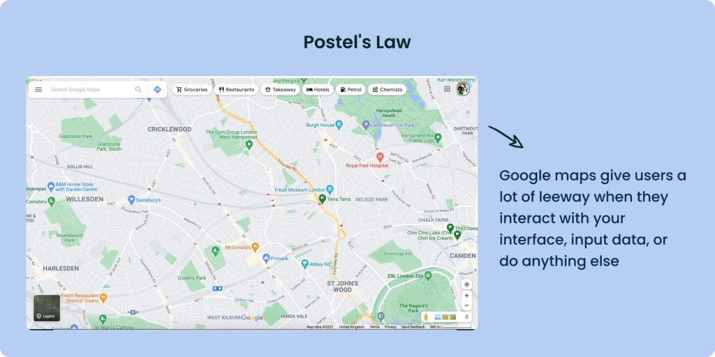
Principle: Don’t restrict users from giving you anything, but limit what you ask of them.
Postel’s Law, also called the robustness principle, has two main ideas.
- Be flexible in what you require from users.
- Ask for only essential information.
In simple words, you should give users a lot of leeway when they interact with your interface, input data, or do anything else. An example of Postel’s Law is when users fill out forms to sign up.
You should make only crucial details, like the user’s name and email, mandatory. Other less important information can be optional. This reduces problems and keeps users happier.
A good example of these laws of UX is Google Maps, where you can insert your location in several ways, like an unclear description, exact address, and even misspelled words, and it would still understand and give you accurate directions.
18. Serial Position Effect
Principle: Users remember the first and last things in a sequence.
The serial position effect is one of the laws of UX design that talks about where things are placed in a sequence. It says we remember the first and last things better than the middle ones.
This leads to two ideas: the Primacy Effect and the Recency Effect.
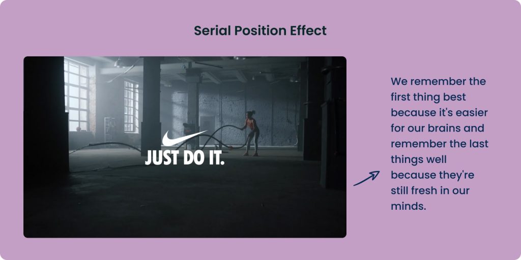
- The Primacy Effect means we remember the first thing best because it’s easier for our brains.
- The Recency Effect means we remember the last things well because they’re still fresh in our minds.
As a result, designers can put the most important things at the start and end of a sequence because people remember those best. Less important elements can go in the middle because people don’t remember them as much.
A good example of the recency effect in the Serial Position Effect can be seen in Nike advertisement campaigns. They always end their adverts with an impactful message, “Just Do It.” This sticks to the users’ minds even long after they’ve seen the ad.
19. Tesler’s Law
Principle: Every system has a certain amount of complexity, which never disappears.
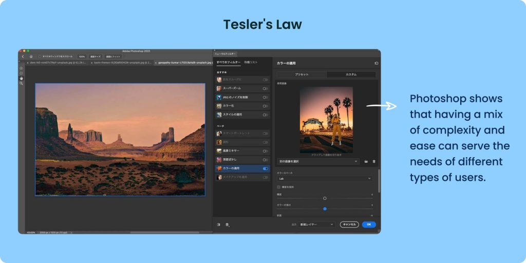
This is another one of the laws of UX design that talks about the complexity of interfaces. It says that complexity is inherent in products, and it cannot go entirely. Instead, it shifts from the user to the developer, and that’s how you can make the interfaces as simple as possible.
For example, SaaS apps often have step-by-step guides to help users get started. This makes the complexity easier to handle as the burden on user’s minds is dealt with through tutorials.
Moreover, it’s necessary to simplify the user experience by telling users how to do tasks like buying items or making playlists in design areas like e-commerce or music streaming.
Have a look at Adobe Photoshop, which is famous for its complex tools and interfaces, which might be difficult for beginners to use. However, this complexity empowers experienced users to produce top-notch work. It shows that having a mix of complexity can serve the needs of different types of users.
20. Von Restorff Effect
Principle: Users remember an object that’s even slightly different than other similar objects.
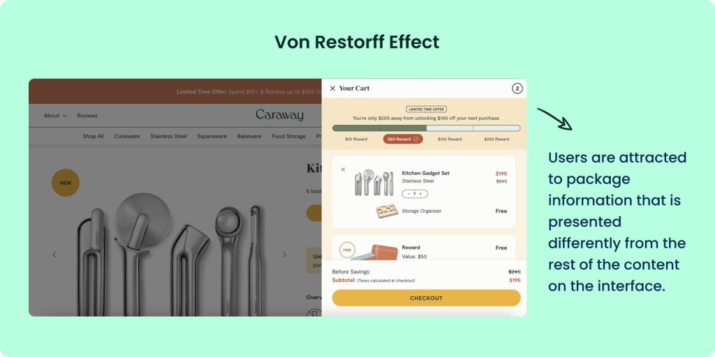
This is one of the laws of UX, which was created by a psychiatrist known as Hedwig von Restorff. He made a simple observation that users are attracted to package information that is presented differently from the rest of the content on the interface.
If you want to steal the attention of the user to convey an important message, it is best to use different colors, fonts, boxes, and elements than the rest of the design. However, it’s important to strategically emphasize visual elements to avoid them competing for users’ attention.
An example of its real-life application can be seen on Caraway‘s website, which uses a full-screen popup with a bright color layout to hook the user.
21. Zeigarnik Effect
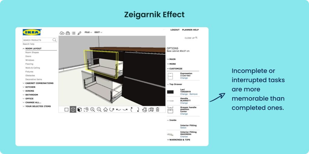
Principle: Users remember interrupted tasks better than completed tasks.
Out of the many rules of good UX, the Zeigarnik Effect is an effective one. Soviet psychologist and psychiatrist Bluma Wulfovna Zeigarnik introduced it. She discovered this principle by studying the impact of finished and unfinished tasks on memory. Her research revealed that incomplete or interrupted tasks were more memorable than completed ones.
This phenomenon also influences user behavior by motivating them to complete tasks. According to Lewin’s field theory, starting a task creates a sense of tension, which intensifies when the task is interrupted or left incomplete. This tension enhances the memory of the task and is only relieved upon task completion.
IKEA’s online planner uses this rule in real life to engage customers and keep them coming back to the website. Here’s how IKEA achieves this:
- Incomplete Room Designs
- Saved Designs
- Recommendations and Shopping Lists
- Email Reminders
- Integration with Online Store
- Sense of Accomplishment
Consult Denovers for your UX Needs
Ready to up your UX design game? Denovers is here to help you. Our design experts are well-versed in the various laws of UX required to make interfaces that make the users stop and stare. From wireframing, functional prototyping, and iteration of your design ideas to troubleshooting problems in your digital products and coming up with viable solutions for them, you can count on us.
We make visually appealing and high-performing interfaces for you.
Conclusion
The various laws of UX are effective guidelines for designers to create winning interfaces that not only look good but also work well. While all of these are not necessary to use, not implementing any of them can result in inefficient designs. The best way to know which ones are applicable is to evaluate your design requirements first and then incorporate them.
FAQs
What are the golden rules of UX?
The golden rules of UX boil down to
- Keep things user-friendly and intuitive.
- Be clear and concise.
- Give clear feedback so users know their actions are working
- Make everything easy to use and understand
- Avoid unnecessary complications
- Look for ways to improve based on what users tell you
What are the 7 laws of UI design?
They are
- Law of clarity
- Law of most popular action
- Law of contexts
- Law of defaults
- Law of guided action
- Law of feedbacks
- Law of easing
What is Jacob’s Law of UX?
People like what they’re already familiar with. This means that when designing something new, it’s smart to stick with designs and features that users already know and understand from other similar products. This familiarity helps users feel comfortable and confident using your product. While innovation is important, it’s best to balance it with what users already know to make things easier for them.
How many laws of UX are there?
Originally, there were 21 laws of UX, which product designer Jon Yablonski introduced in his book, “Laws of UX.” Although many more UX laws are used as best practices by designers to create user-friendly products, it is always advised to keep these in mind while designing interfaces.


