Have you come across the term “High-Fidelity Wireframes”? Sounds complex, right? But if you enter the design industry, you will notice that wireframes are a designer’s best friend. Wireframing is the starting point of every UX design project. Without this preliminary step, designing SaaS platforms would be like shooting arrows in the dark.
We are a product design agency that puts us in the perfect place to talk about high-fidelity wireframes and things related to them. Stay hooked on this article as we will discuss this topic from scratch to address all your concerns regarding wireframing.
Let’s get started.
Avail
Free SaaS UX Audit Checklist
Ultimate UX Audit Checklist compiled by Top-rated UI/UX design professionals on how to make your SaaS app amazing.
What is a Wireframe?
A wireframe is a skeletal framework of a website’s final UX design. This screen blueprint is a layout that presents the interface’s
- Structure
- Flow
- Functionality
- Behavior
- Architecture
Wireframes are page schematics that act as a visual lead for designers and product managers. They may seem complex from the outside, but they are simple models that provide direction, save the time of the parties involved in the project, and ensure the creation of smooth and flawless products.
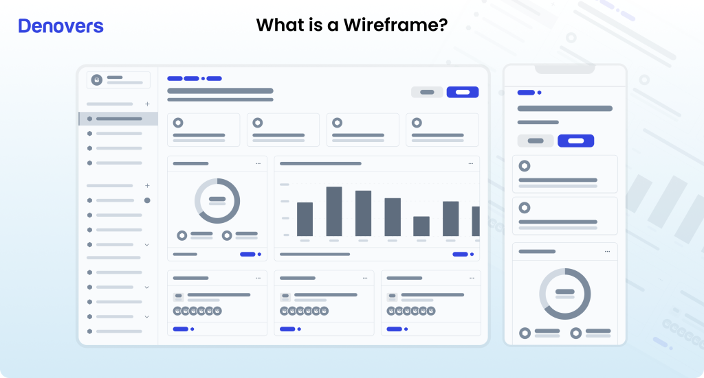
Wireframes can be drawn manually by hand or even digitally. It all depends on the amount of detail required. Moreover, wireframes use placeholders instead of descriptive content, full-color, and branded graphics.
When and why do you Need Wireframes?
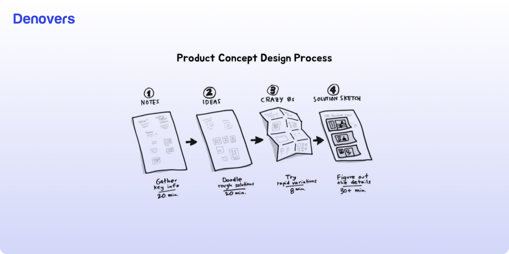
According to the Nielsen Norman Group, using wireframes can reduce design time by up to 50%. Wireframes are typically needed at the start of every project as that is where designers craft the project’s objectives and structure. Using them before starting any project keeps the team focused on a united goal and keeps product managers informed about the UX design.
It has been estimated in a survey by Balsamiq that 85% of designers use wireframing to plan the layout and structure of a website or application. Want to know why they are so popular? That’s because wireframes come in handy for a variety of reasons.
- Creating an outline of the hierarchy pr typography of user interfaces
- Making a visual guide of SaaS platform screens
- Plan transitions and interactions
- Organize the interface to deliver valuable information to the team and end users.
Types of Wireframes
There are different types of wireframes. Let’s have a look at them.
Low-Fidelity Wireframes
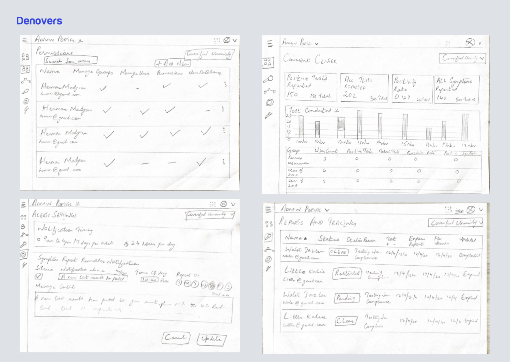
Low-fidelity wireframes, also known as lo-fi wireframes, are basic sketches of a user interface. They are the most basic blueprints and outlines of a webpage, application, or screen. Low-fidelity wireframes use simple shapes like circles and rectangles to present UI components like text boxes, images, and buttons. They are made without any color, fancy fonts, or other descriptive details.
Lo-fi wireframes are quickly created using pen and paper or basic digital tools. They usually include small notes for different sections to elaborate on that particular part of the webpage or app. A low-fidelity wireframe’s main goal is to convey a product’s value proposition and its core value. It only focuses on how the platform will be organized and how users will interact with it. It brushes aside the need to include imagery, editorial copies, or other finer details.
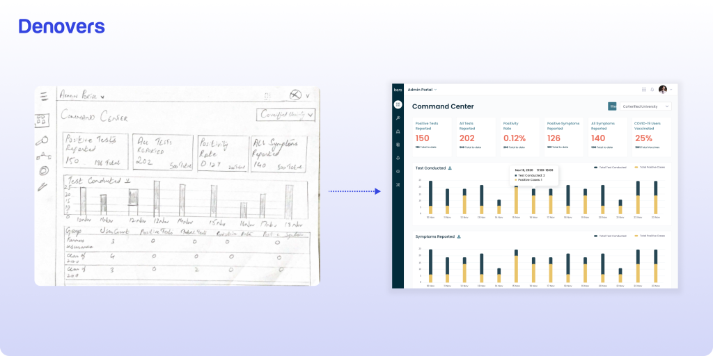
Have a look at the low-fidelity wireframe below which we designed for a software that uses COVID-19 test results, vaccine records, and symptom data to verify real-time compliance and help organizations re-open safely.
Medium-Fidelity Wireframes
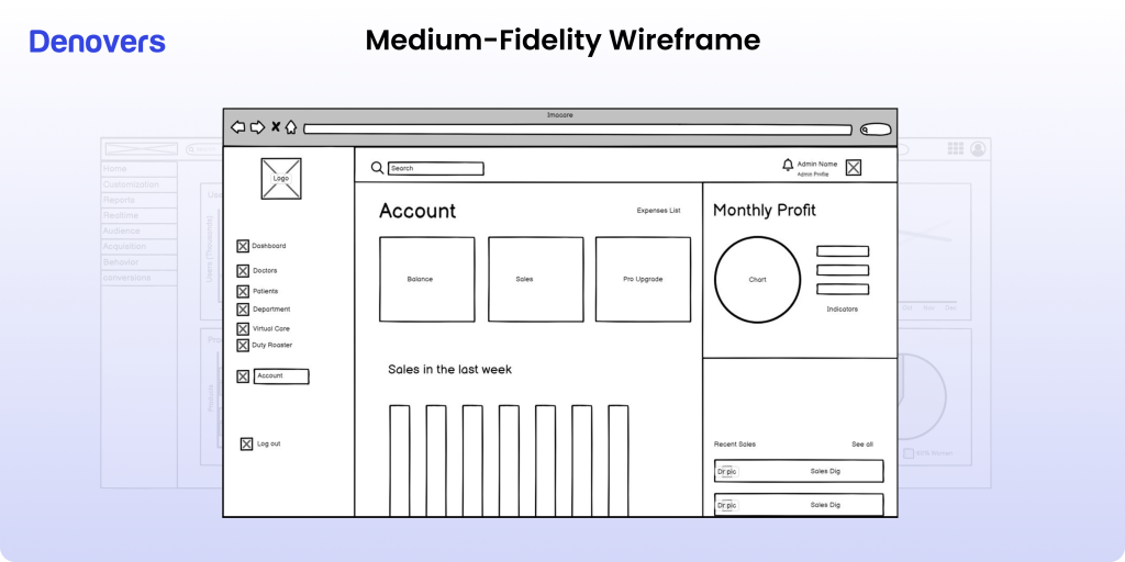
Medium-fidelity wireframes are definitely a step up from low-fidelity wireframes but still less comprehensive than high-fidelity wireframes. They offer more information, from accurate spacing and proper headlines to proper buttons and highlighted visual hierarchy.
Medium-fidelity wireframes are usually created using a wireframing tool to ensure accuracy, precision, and detail. This wireframing model is sometimes also presented in a wired flow, a hybrid design document showing how various web pages work together.
Their beauty lies in having just a slight increase of integrations but still not overwhelming the user with intricate details. Medium-fidelity wireframes are a great tool for getting constructive feedback from the user, which can be utilized to fine-tune the final UX design.
High-Fidelity Wireframes
High-fidelity wireframes, or hi-fi wireframes, are important in creating a solid UX design. This wireframing model presents the entire screen’s layout and architecture with intricate detailing. They are not limited to the general structure, as they map all user interactions on the interface to provide a detailed and practical visual representation of the application.
These design drafts include fine detailing of the particular screen or product.
- UI elements
- Colors
- Interactions
- Graphics
- Branding
- Copy
- Logos
- Buttons
“High-fidelity wireframes are thrilling as they embody your final product’s essence. They give life to your abstract ideas and strike a creative dialogue between the design team members and stakeholders“, says one of our top designers, skilled in creating hi-fi wireframes at Denovers.
Without a doubt, hi-fi wireframes present the look and feel of a SaaS platform before it even comes into existence. This not only results in a constructive collaboration between design team members but also ensures all team members are following a shared goal.
High-fidelity wireframes should be created at the end of the design planning process. This is because first, you need to complete your user research and decide the platform’s content and layout. This way, you can effectively bridge the gap between designers and developers to create head-turning SaaS products.
We even created a high-fidelity wireframe for the same platform for which we created a low one. Have a look at it
Low fidelity vs High fidelity wireframes. When to use what?
Once you are aware of the different types of wireframes, we know the question popping into your head is when to go low or high when it comes to fidelity in design.
In order to know when to go for low or high-fidelity wireframes, it is essential to understand the depth of a project’s complexity. If the project is simple and straightforward, start off with a low-fi wireframe to present the central mission through basic structures and layouts.
However, as the project gets intense and complicated, continue adding more details through buttons, logos, text, and various components to elaborate the impression of the final product. This way, you can use a high-fidelity wireframe by building on the same low-fi one.
Practically, both low and high-fidelity wireframes are really just two sides of the fidelity tunnel. Design teams seamlessly incorporate the UI elements of both low-fi and hi-fi wireframes as their projects are involved according to their detailing levels.
Let’s take an example. Suppose you’re working on an existing website or adding a new feature to an app. Now, your team will jump straight into it and start wireframing by topping low-fidelity wireframes on the existing high-fidelity ones for configuration. Moving towards the development, the design team will refine the low-fi components as the development team will already be familiar with the requirements.
The NN group proposes that fidelity in a wireframe or prototype varies in three areas.
- Interactivity
- Visuals
- Content
This simply means that designers should mix and match low and high-fidelity wireframes as the project evolves to create smooth and effective workflows for your SaaS platforms. It’s not only about understanding fidelity but also having the freedom to pick any type of wireframing model. It all boils down to deploying the right method depending on your project’s resources, timeline, and expectations.
Confused about which UX wireframe model type to opt for? Sit back, relax, and let Denovers handle that for you.
We have dedicated designers who are each experienced in first assessing through a UX audit which wireframe model would be deemed fit for your platform. Our expert dedicated designer will then do wireframing for you to create world-class SaaS web and mobile applications.
Are wireframes, prototypes, and mockups all the same? (The dynamic trio of design)
Many people are confused about whether wireframes, prototypes, and mockups are all the same. They are all different, and let us show you how:
Steps to Create a High-Fidelity Wireframe
It can be advantageous to have a low-fidelity wireframe as you can build on it to turn it into a hi-fi one. However, if you are building a high-fidelity wireframe from scratch, you must have a solid understanding of the process, as it includes many steps. Building an outstanding hi-fi wireframe is always a gain, resulting in a high-quality website.
So, let’s drill down to see how it is created.
1) Define user and business goals for the platform.
Before creating your hi-fi digital wireframe, it’s important to know about your target user and their needs so that you can provide them with relevant products and services. Additionally, define your business goals to ensure your wireframe contains what you aim to achieve.
2) Arrange content on the page by category.
Once you are fully aware of your users’ goals and business objectives, it’s time to arrange the scattered data. Start categorizing the information so that it is easy for your users to navigate the website. This is super important; if you want your business to flourish, make it easy for your users to find what they want. As a result, you have to set aside unnecessary or distracting elements from your application and keep the important content concise and accessible.
3) Decide functional elements
Next, to create a high-fidelity wireframe, you have to segment the screen to make blocks and fill them with elements. Think about the user journey on your platform to carefully add components so that users can seamlessly move from one section to another.
Integrating a special feature in every block to keep the user hooked on your SaaS platform like dropdown menus, call-to-action buttons, and other clickable and functional elements, is key. This lets your users explore the products or services to make decisive decisions.
4) Create a hierarchy of the blocks based on their level of importance.
It’s time to walk in the footsteps of your target audience and build a hierarchy on the screen. According to surveys, users scan a page by following an F-pattern or a Z-pattern. Check the analytics to see which sections of your screen are the most attention-grabbing so that you can place those blocks in places where the user’s gaze will definitely fall. This will ensure your product branding is hitting the right spot.
5) Ensure your design is scalable.
Your audience can access the website via a PC, tablet, or mobile device. Therefore, it’s important to test the scalability of the design across various screen sizes and resolutions. This ensures that content displays correctly across different scales. A helpful approach is to begin with a detailed wireframe for smaller screens and then progress to larger ones.
6) Create notes so that users can understand your design
Some sections of your high-fidelity wireframe may be hard to understand, or their functionality and usability are not easy to interpret. In such sections, you should add notes to make it understandable. These descriptions can help you smoothly blend the static visuals of your wireframes into the dynamic experiences of the final UX design.
5 Tools to Create Wireframes
There are several tools available to make effective wireframes easily.
Adobe XD
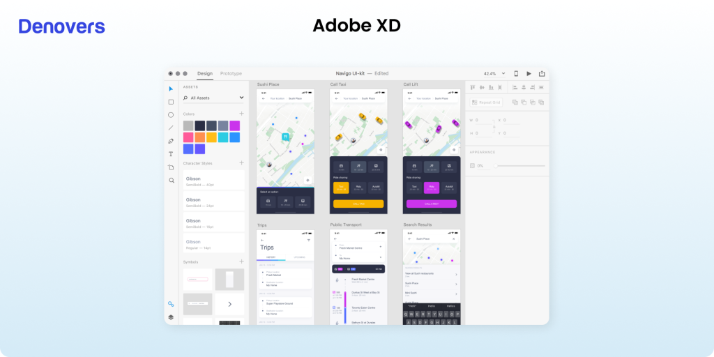
Adobe XD, by Adobe, is your friendly, versatile design tool that can handle everything from wireframing to high-fidelity design. This tool offers vector-based drawing tools, interactive prototyping, voice commands, and plugins for extended functionality. You can easily integrate it with other Adobe Creative Cloud products. If you’re a designer looking for a versatile toolkit, Adobe XD has you covered.
Moqups
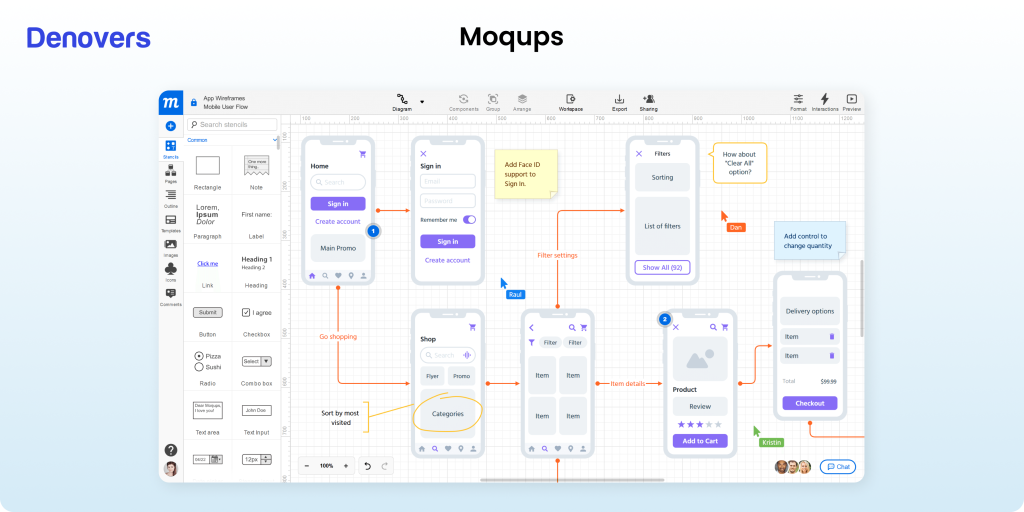
If you’re looking for a user-friendly web-based companion for wireframes, mockups, and prototypes, go for Moqups. This intuitive tool helps you create various distinctive features like a drag-and-drop interface, built-in stencils, and other real-time collaboration features. Moqups create low- and high-fidelity wireframe designs, and you can even manage version control. This tool is best for teams who want a simple, collaborative tool that supports the entire design process, from wireframing to prototyping.
Sketch
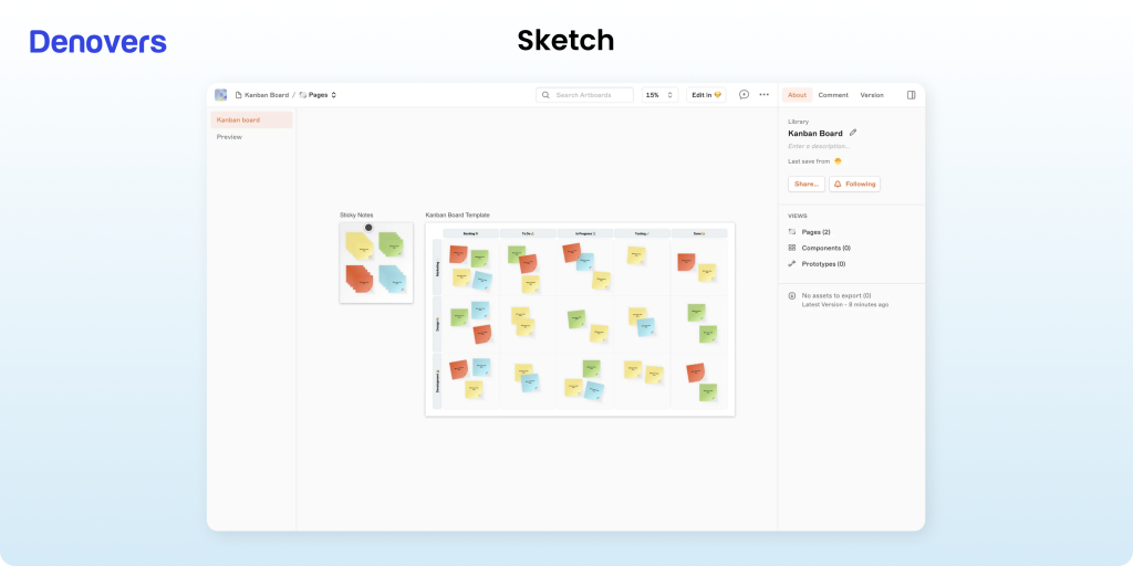
Introduced in 2010, Sketch has made a solid position in the design industry. This tool is exclusively for Mac users. Sketch is ideal for creating anything from wireframes to sophisticated UI designs and icons on a pixel-based canvas. This tool has a more user-friendly interface than heavyweight tools like Affinity Designer and Adobe Illustrator. Its simple features rapidly help designers create digital wireframes using artboards and vector shapes. This application does not offer built-in UI components. However, an extensive online community provides free wireframe design kits with ready-to-use buttons, icons, and more. Sketch also supports Android and iOS layout templates and integrates with Unsplash for royalty-free photos.
Figma
Figma is an exceptional cloud-based alternative to traditional design tools like Sketch as it offers a full suite of features even for free users. This design tool is best for individual designers and large teams as it aids in seamless collaboration with its web-based platform. Figma offers
- An integrated online whiteboard called FigJam
- Brainstorming
- User flow mapping
- Wireframing
- UX Prototyping within the same interface
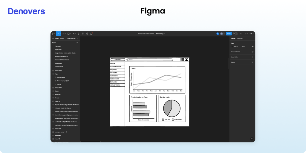
Figma is super intuitive, with custom UI components and efficient organization through its left-hand panel. It offers responsive design through flexible layout options like column overlays and constraints. Notably, Figma’s vector-based pen tool simplifies complex shape creation with its versatile vector networks. This popular design tool is best for team collaboration due to its countless features like real-time editing, Spotlight demos, and interactive comments directly within design files. Additionally, Figma offers developers CSS extraction, and Dev Mode features to give them a smooth handoff from design to implementation.
Justinmind
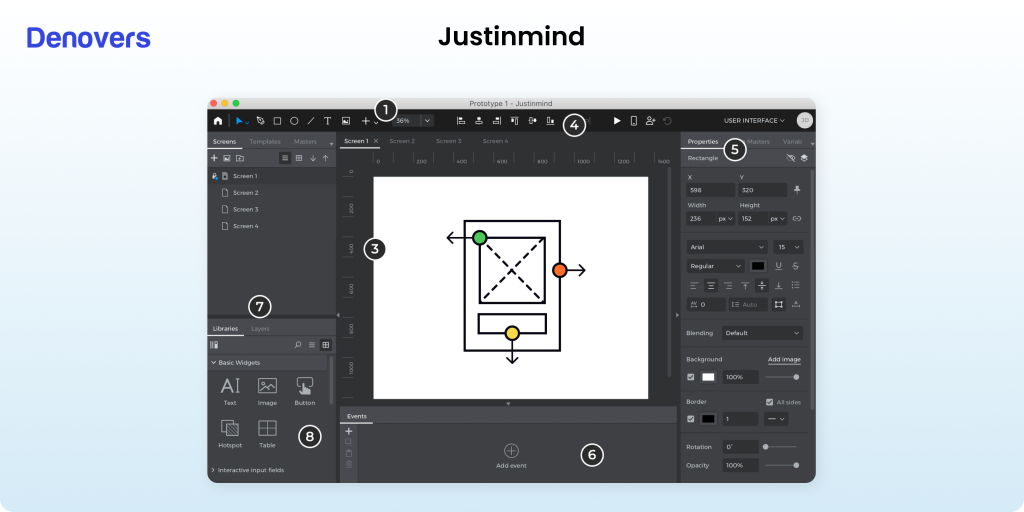
Justinmind stands out for its user-friendly interface, ease of use, and robust focus on creating interactive prototypes right from the wireframing stage. This innovative tool offers built-in interactive elements such as text inputs, radio buttons, and dropdowns. This is helpful for designers as they can easily integrate realistic user interactions in just a few clicks. Justinmind significantly accelerates the prototyping process by saving hours or days of work on projects.
The tool offers excellent usability and navigation through its intuitive layout, as design elements are neatly organized on the left, and project management tools on the right enhance usability and navigation. Although its advanced features may seem overwhelming for simple, minimalist wireframes, Justinmind remains an excellent choice for designers seeking early, detailed feedback on interactive designs with minimal effort.
Wireframing with Denovers
We are industry experts in creating wireframes for your SaaS platforms. Our expert designers turn complex ideas into intuitive, user-friendly designs that boost your product’s success. We collaborate closely with you to ensure each wireframe aligns with your brand, enhances user experience, and meets your business goals. Denovers is your go-to partner for exceptional SaaS wireframe design as we focus on quality and quick turnarounds.
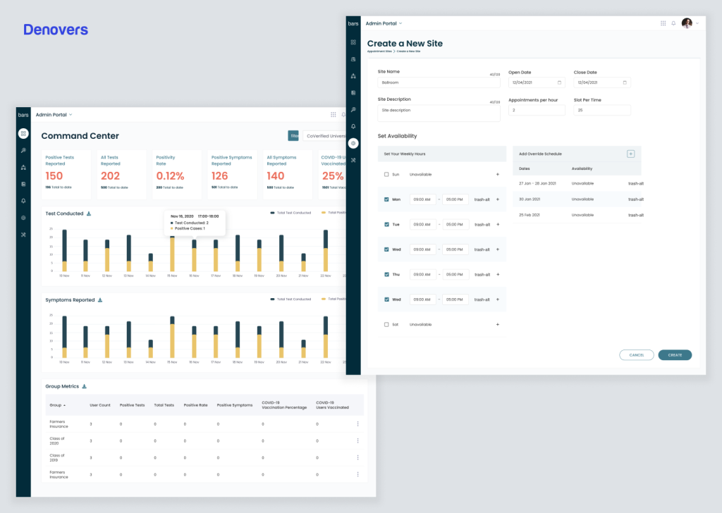
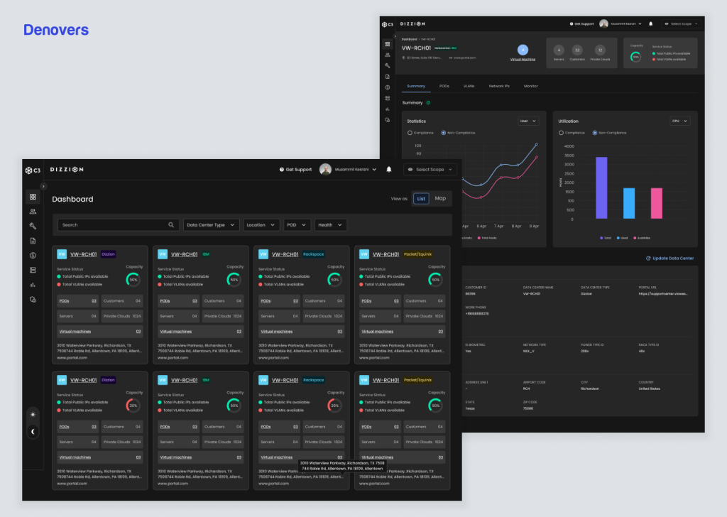
We can offer you all types of wireframing services including low, medium, and high-fidelity wireframes. Have a look at the high-fidelity wireframe we created for a DaaS provider.
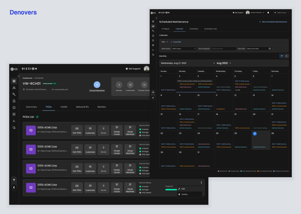
We created various hi-fidelity wireframes for the platform’s different screens.
Let’s create something great together!
Wrap Up
A high-fidelity wireframe is the best choice if you’re looking for accuracy and detailed visualization in design. This wireframing model is the best tool for narrowing the distance between simple conceptualization and the final design, as it offers a clear view of the final product. Not only do hi-fi wireframes come in handy when a sophisticated design needs to be presented, but stakeholder feedback is crucial to getting the design process moving. From creating a design from scratch to refining a SaaS UX design, high-fidelity wireframes are the optimal approach. They ensure the creation of a smooth product with flawless structure, efficient functionality, amazing interactivity, and increased user-friendliness.
FAQs
What is high fidelity in UX?
High fidelity in UX refers to a design prototype’s level of detail and realism. It aims to closely resemble the final product in terms of visual appearance, interactions, and functionality. High-fidelity prototypes often include realistic images, colors, fonts, and interactive elements, providing a more accurate representation of how the final product will look and behave. This level of fidelity is crucial for gathering meaningful feedback from users and stakeholders before moving into the development phase of a project.
What is the difference between high and low-fidelity wireframes?
High-fidelity wireframes are detailed and closely resemble the final product regarding visual design and functionality. They typically include colors, fonts, images, and more detailed UI elements to represent the final interface clearly. On the other hand, low-fidelity wireframes are rough sketches or basic representations of the layout and structure of the interface, as they lack detailed design elements. They focus more on the overall layout, content hierarchy, and user flow without getting into specific visual details or aesthetics. High-fidelity wireframes are useful for presenting design specifics and interactions, while low-fidelity wireframes are ideal for quickly exploring and iterating on ideas without being distracted by visual details.
What is a UX wireframe?
A UX wireframe is a visual representation or blueprint of a user interface (UI) that focuses on the functional elements and structure of a digital product or application. It serves as a skeletal framework that outlines key components, content placement, and the overall layout without incorporating detailed design elements like colors, fonts, or images. UX wireframes are essential in the early design stages to visualize and communicate the user experience. They help designers and stakeholders to iterate on concepts, test usability, and ensure the logical flow of interactions before moving into more detailed design phases.
Are mockups high fidelity?
Mockups can vary in fidelity depending on their purpose and stage in the design process. Usually, they are visual representations of the final product that incorporate more detailed design elements such as colors, typography, images, and sometimes interactive elements like buttons and navigation bars. They often reflect the aesthetic and visual identity of the product to give them higher fidelity compared to wireframes, which are more basic and focused on structure. However, mockups may not be as polished or interactive as prototypes, typically closer to the final product in terms of functionality and user interaction. Therefore, while mockups are often considered high fidelity in terms of visual design, they may not necessarily represent the final product’s full functionality or user experience.


